A [before it's too late] Summer House Tour
It's hard to believe that I actually put together a Summer house tour, but not hard to believe I forgot to post it until now, the end of August! For the sake of ever-changing spaces, and to provide sources for all of the new things in our home, let's get started on this little tour, shall we?
The Pink Front Door
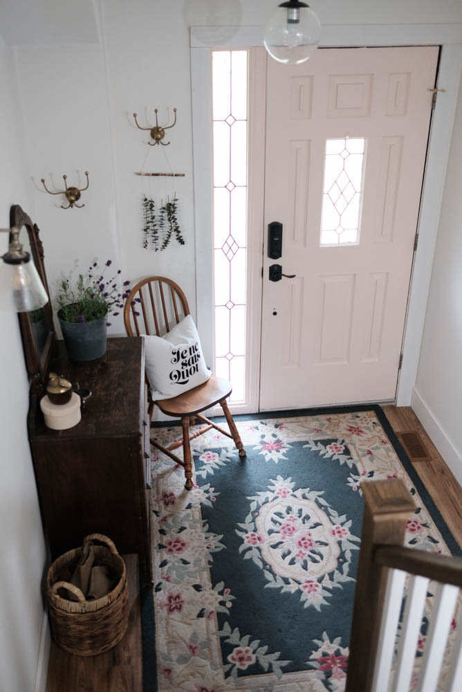
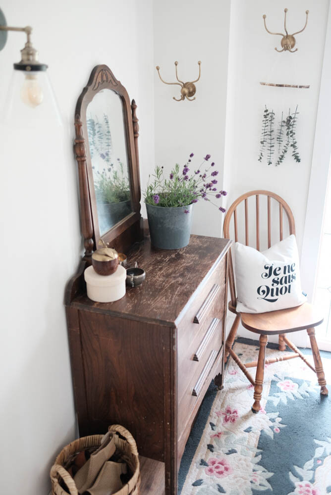
This space doesn't change too much with the seasons. We've recently added a basket for the kids to throw their shoes and hats into since we use this door a lot more in the warmer months than we use the mudroom/garage entry. You can see how we made over this space by checking out this post!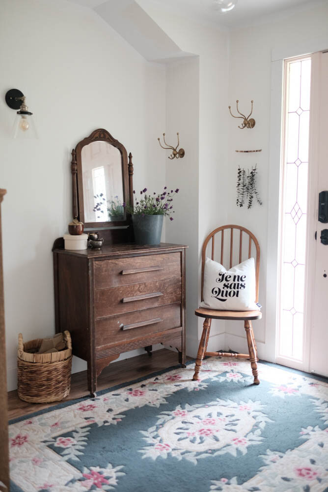 The rug in here was second hand and cost me $5. I thought it would be a temporary thing, but it's been almost a year now! The vintage dresser needs to be fixed still (the drawers are super sticky), but it's great to have a spot to toss all the random things we bring into the house!
The Gingham Dining Room
We recently made some changes to the dining room by adding a round mirror and painting the table (which you can read about here), and I'm still loving the buffalo plaid wall!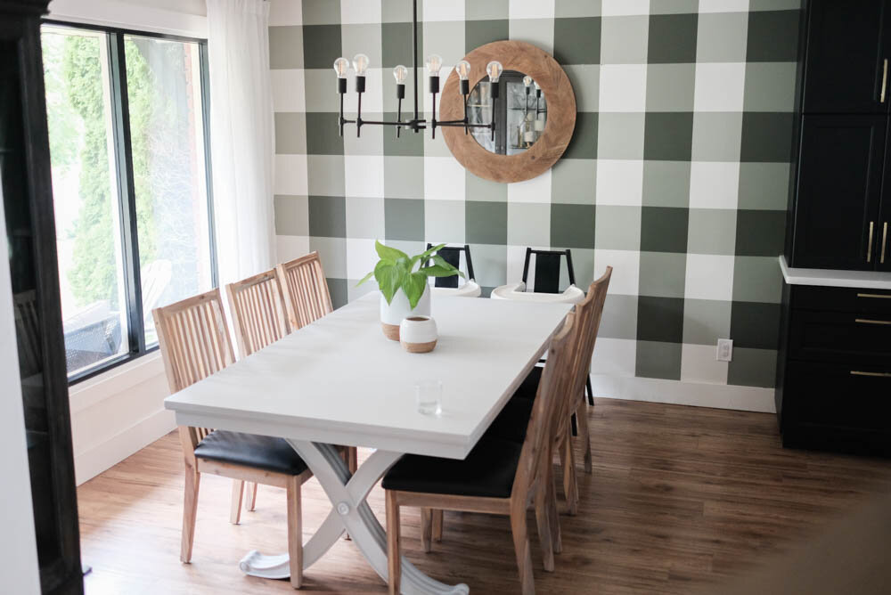 The kids' high chairs are a part of the space now, and we specifically chose these black and white ones so that they would always remain neutral in our space.
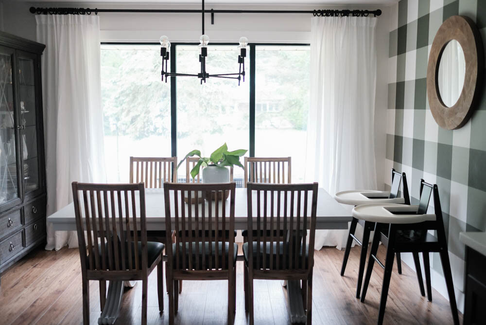
 The new mirror is from Homesense, and I am SO HAPPY with how it looks in here. Previously, there was a rectangular black mirror there, and it was just so wrong for the space.
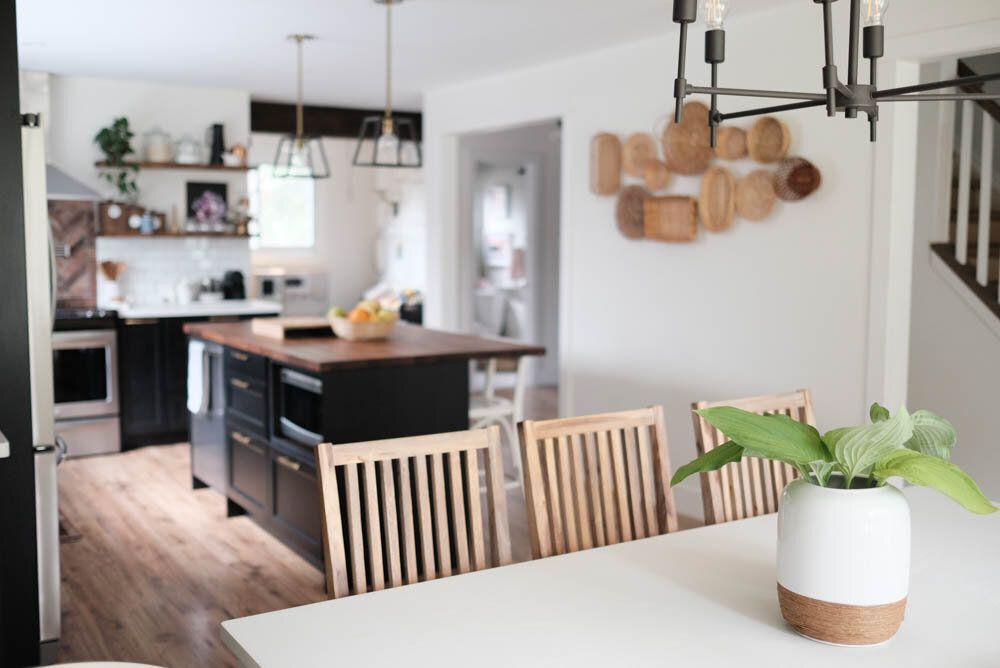
The Black Kitchen
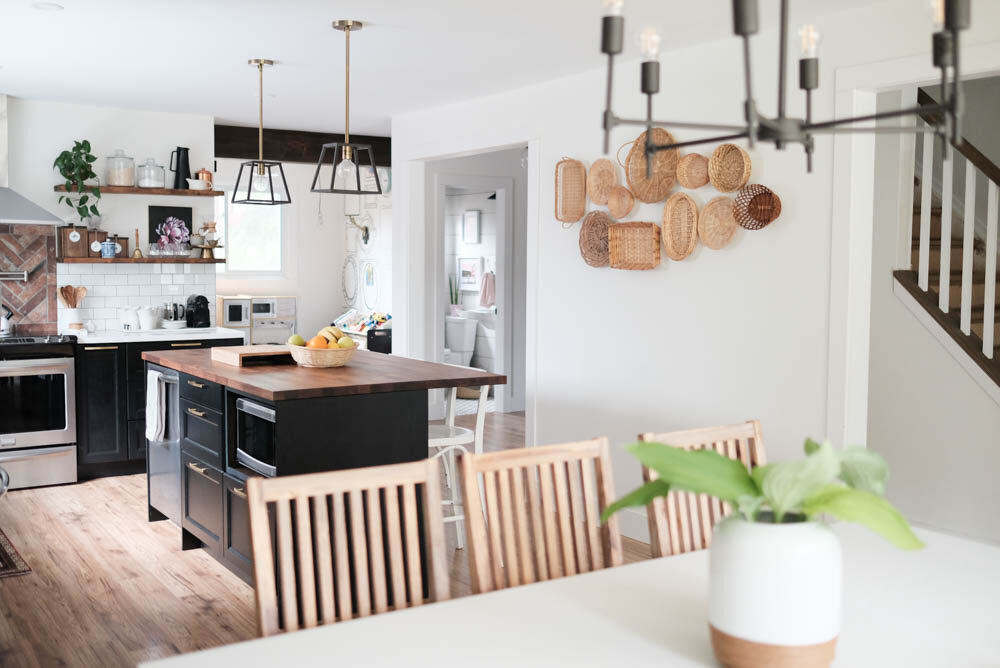
The only thing that really changes in this room is how much stuff I choose to have on the shelves and countertops - depending on the season, I want things sparse, but sometimes having things around, like plants, can make the space feel so much cosier. If you want to see how we put together this kitchen using IKEA cabinets, check out this post!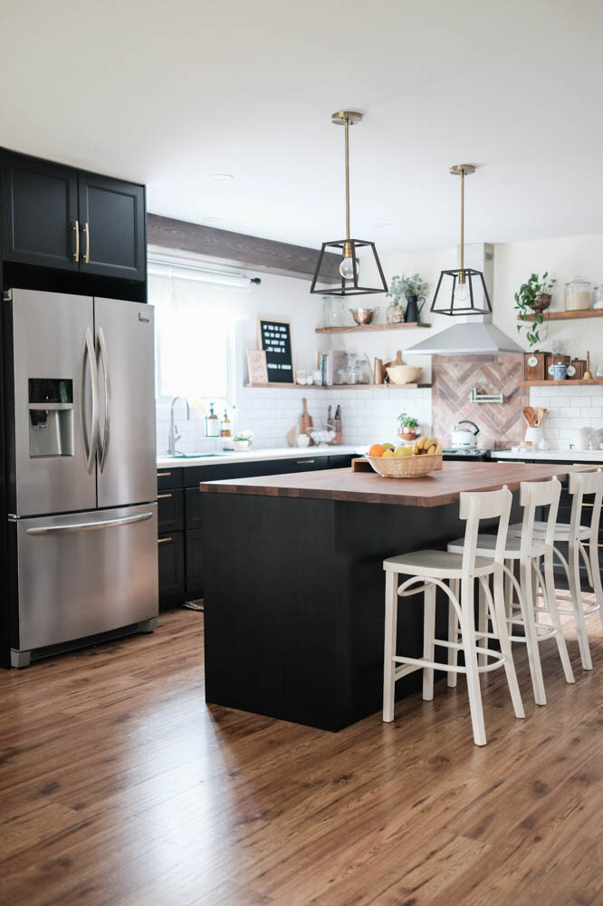

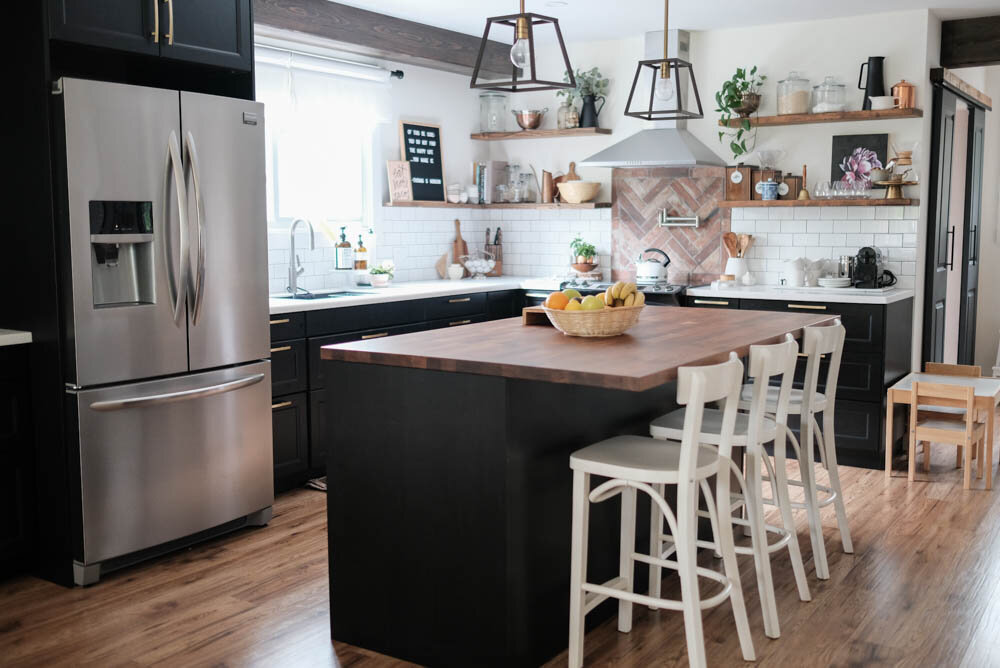 I'm working on a blog post about this basket wall because this was by far the least expensive wall treatment I have ever put up anywhere! I love the texture and warmth and love that there's a continuous mix of wood tones happening in this space.
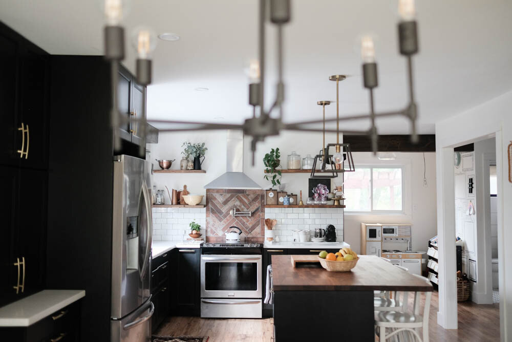

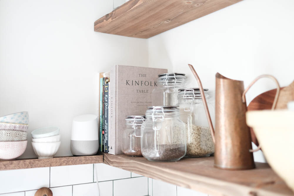
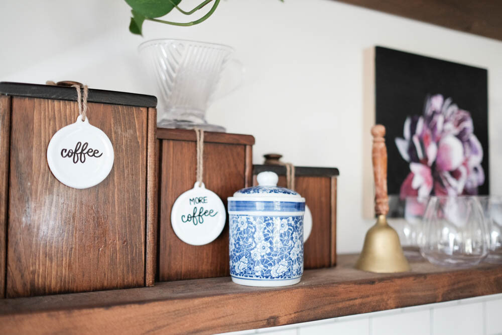
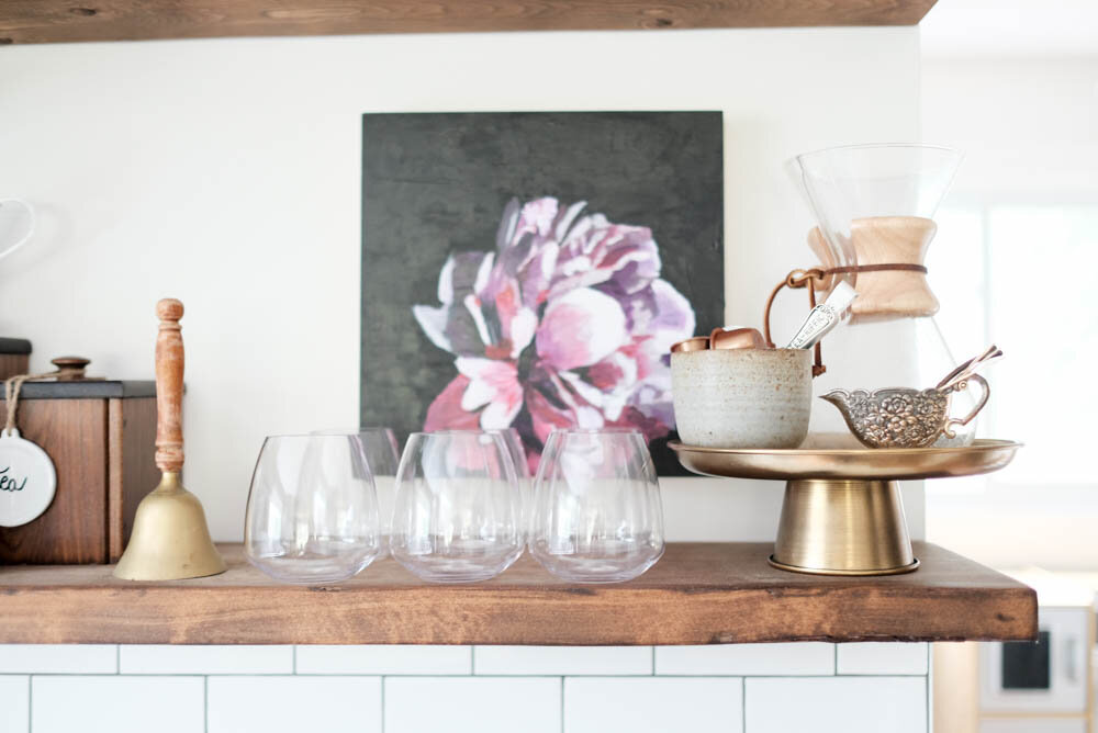
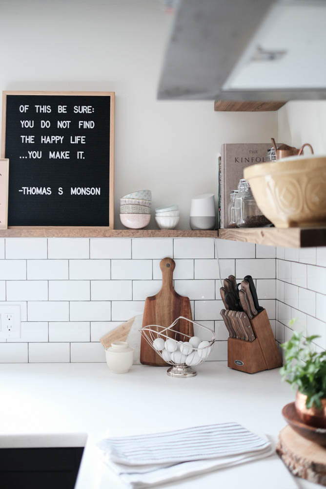 I love having vintage pieces around the kitchen, so these open shelves usually get filled with my favourite things. The painting, however, is new and was made by my friend Bri. Check her out at Bri Hill Creative.
Kids Play Area
This space is open to our kitchen, so it also doesn't change much unless the kids are building super-tall towers, cooking a massive meal in their tiny kitchen, or generally causing major chaos!
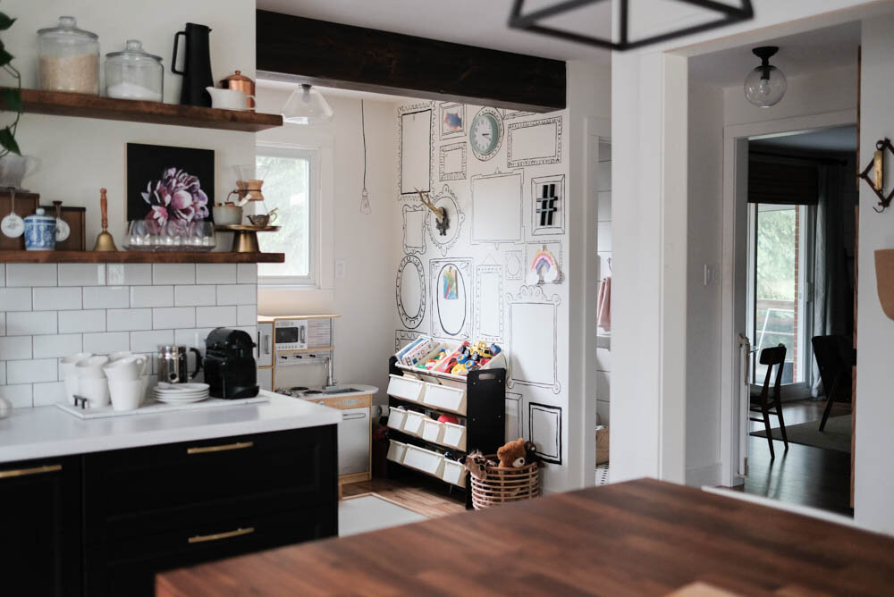
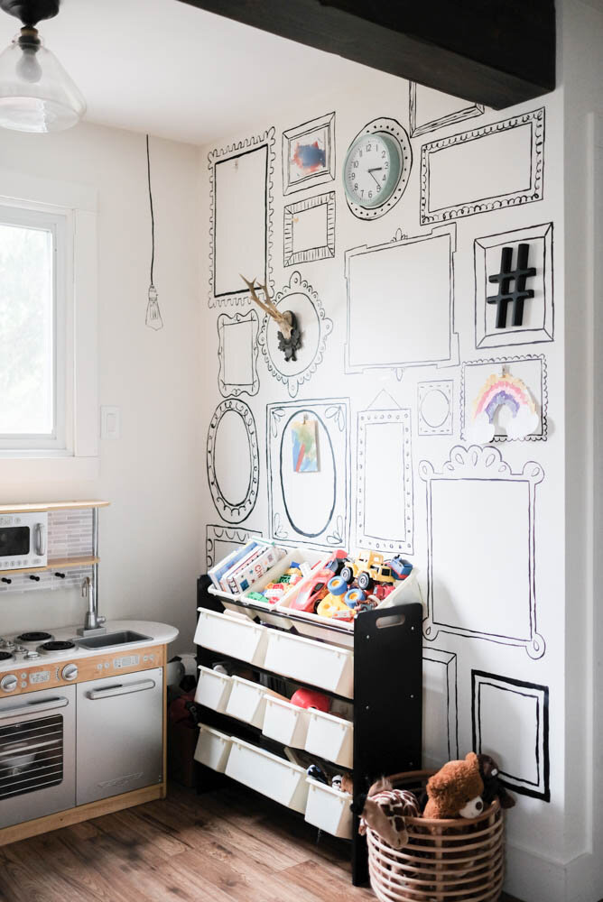 Having a little table for them here means it's easy to have them busy with an activity while we cook or clean or work...
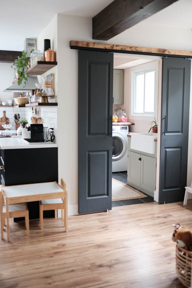
The Pink Laundry Room
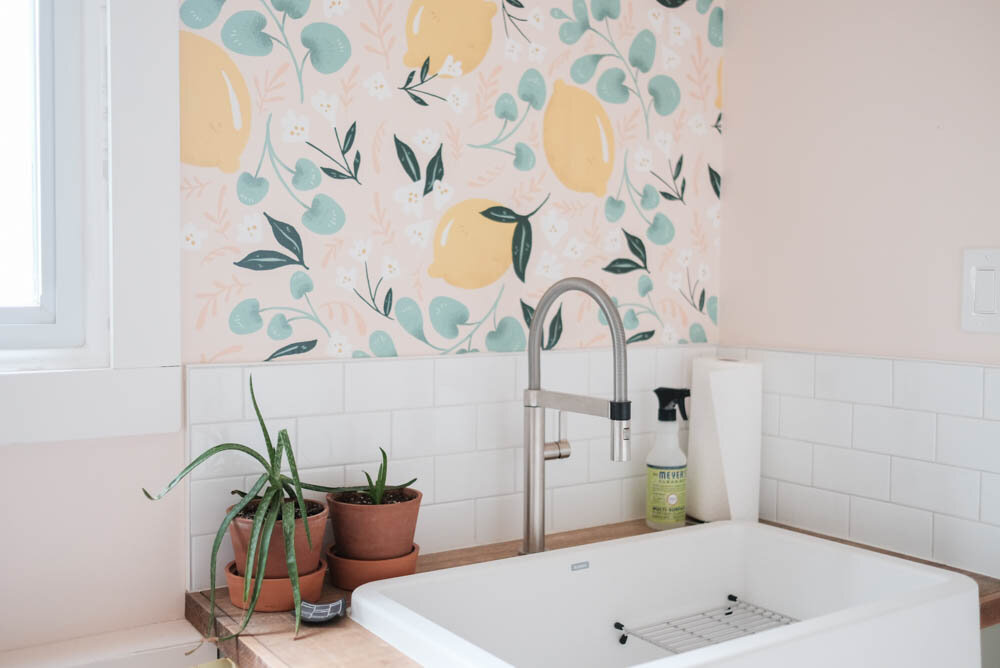
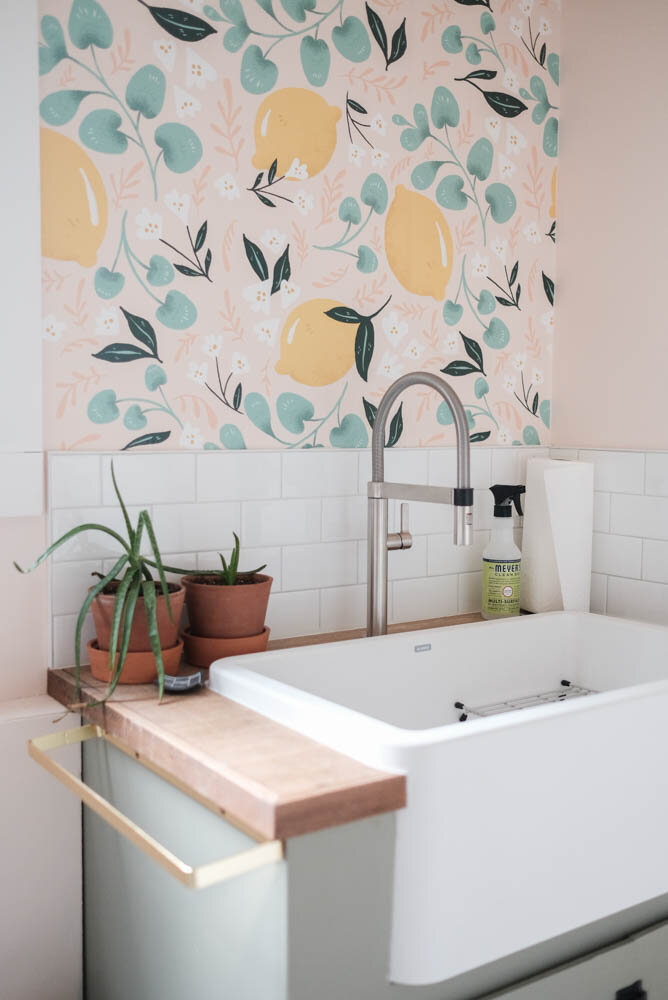
This was a project we completed over 6 weeks and includes a pink lemon wallpaper that I swear is still one of my favourite things about this house! You can see the whole makeover here.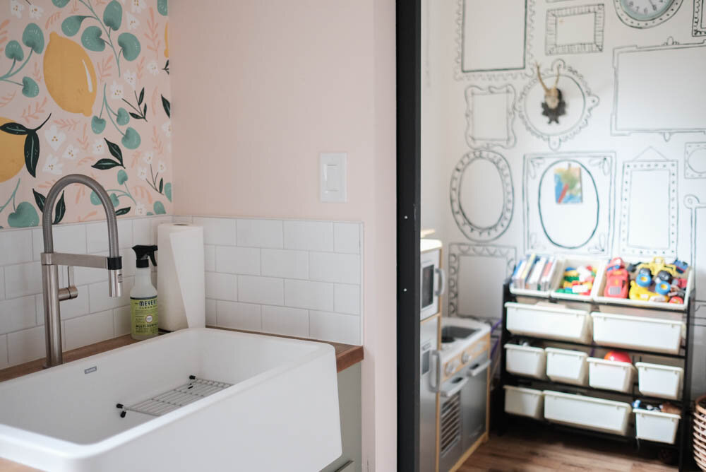
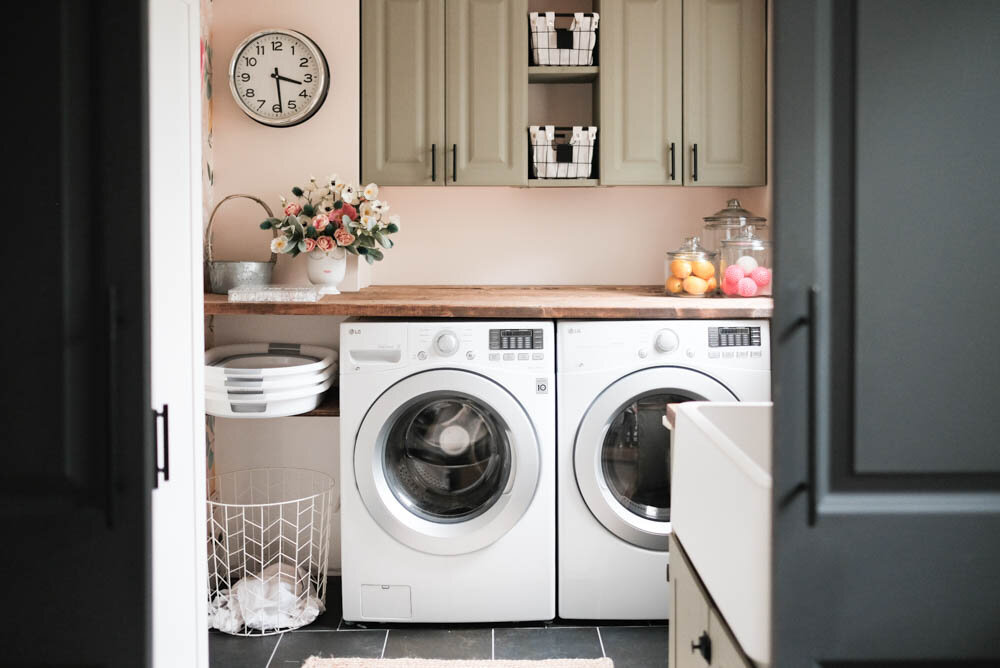
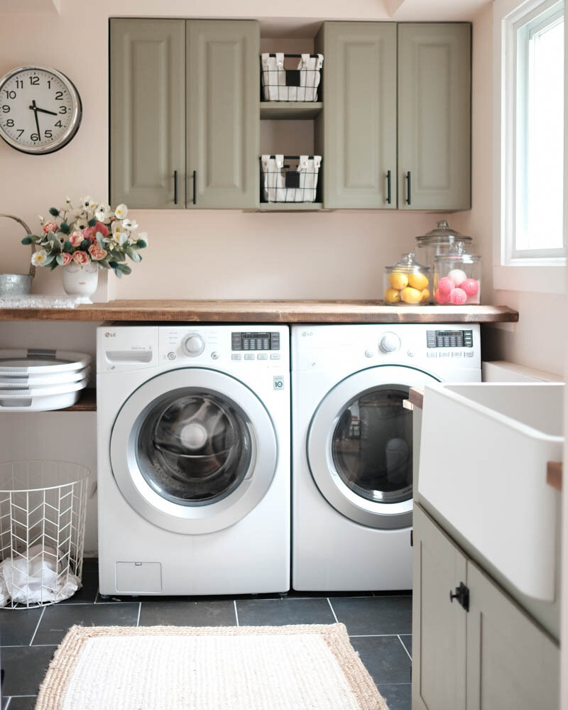 I recently shared how we made these wood countertops for the sink and above the washer/dryer. They were easy and inexpensive, which is the ultimate combo!
The Shiplap Powder Room
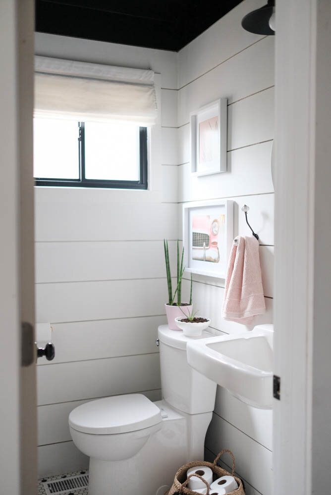
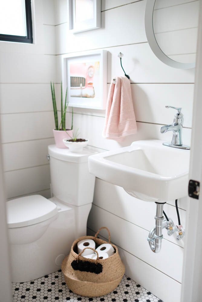
It's little, but this powder room with shiplap walls, a black ceiling and pink accents is a sweet space when my boys aren't shoving HotWheels into the toilet, that is! This was another One Room Challenge that you can see here!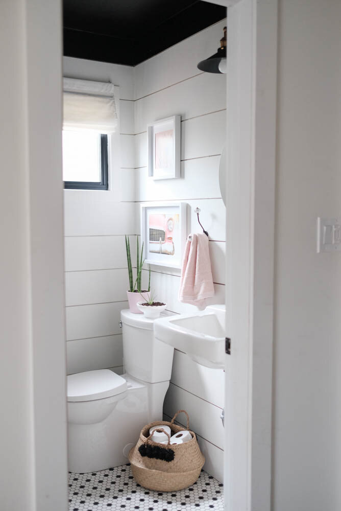

The Family Room/Office/Breakfast Nook
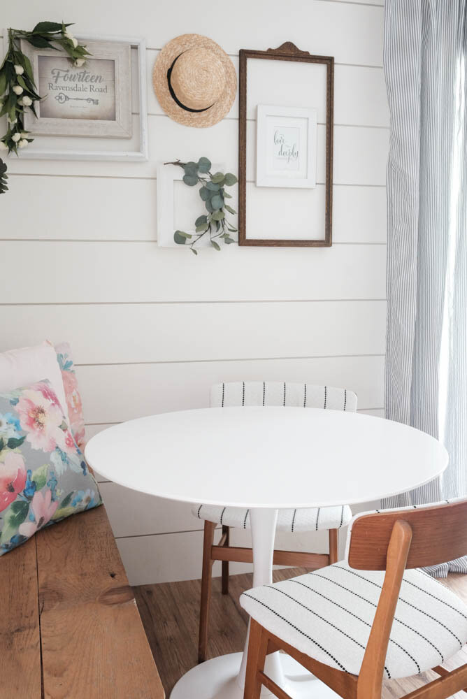
This room is majorly multi-functional. This is where my husband has his desk, where the kids watch all the Paw Patrol they can handle, and where we occasionally like to play board games or have a nice snack at. It's a total family room because we are all in here a LOT! See where we started with this space in this post!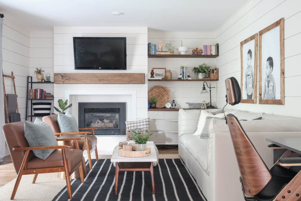
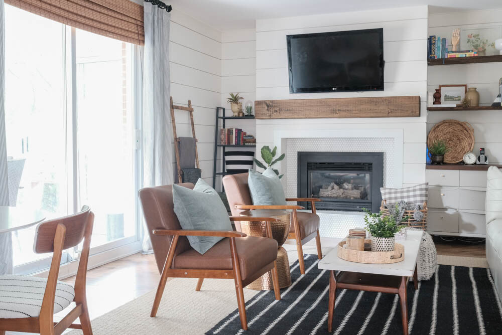
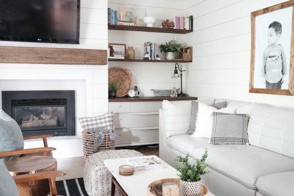
 Reupholstering these chairs in this white fabric might sound insane, but this Toulouse Onyx Fabric from Tonic Living is totally stain resistant! My kids have already tested it with some raspberries, so I know first hand how easy it is to clean!

The Moody Master Bedroom
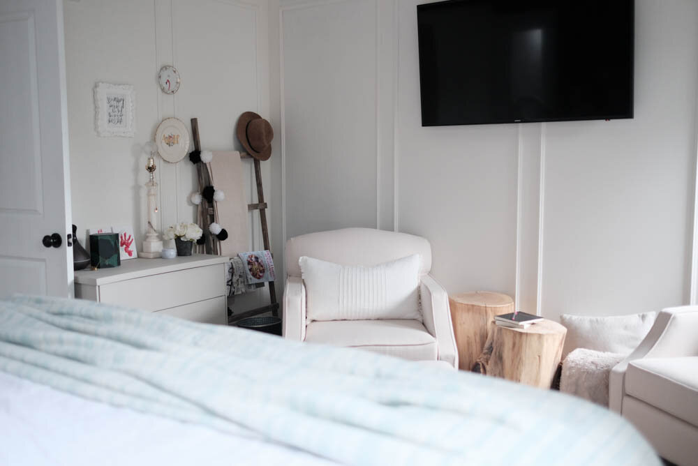
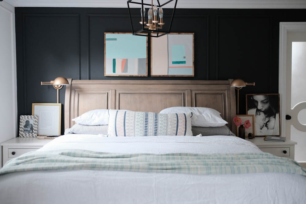
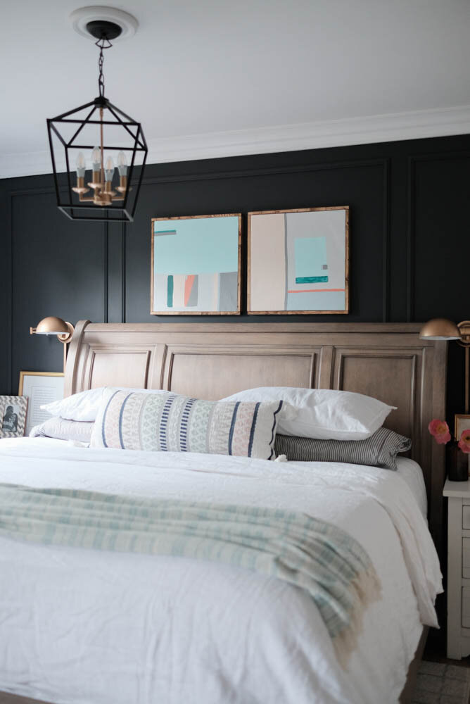
I'm still pretty much obsessed with this room, which is great because I get to sleep here! The panel moulding on the walls (from Metrie's Fashion Forward collection) makes all the difference, and of course, the moody charcoal wall behind the bed adds to the overall cosy feelings in here, too.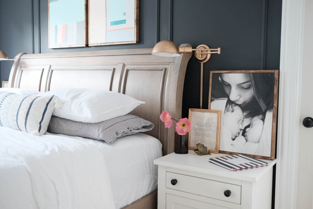
 We majorly upgraded our bedding when we got a set of linen sheets and duvet cover from Primary Goods and HOLY SMOKES, it was the best decision ever! Did you know that they have snaps on the duvet cover and flat sheet that connects them so that you never ever have to worry about crumpled up sheets at the foot of your bed ever again? Not to mention that it makes making the bed like 8,000 times easier. Just saying...
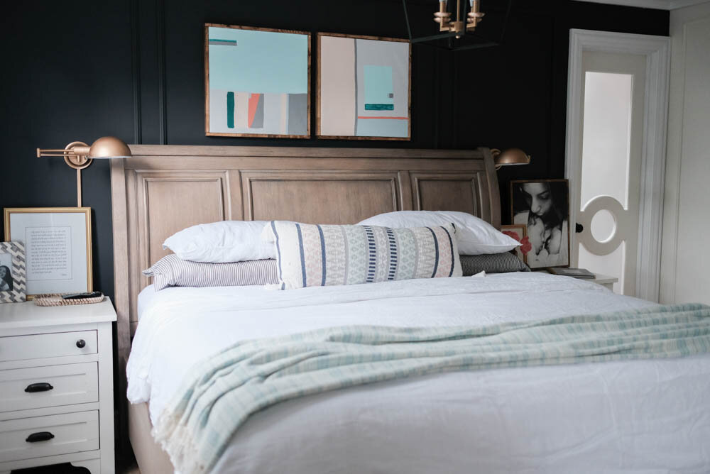
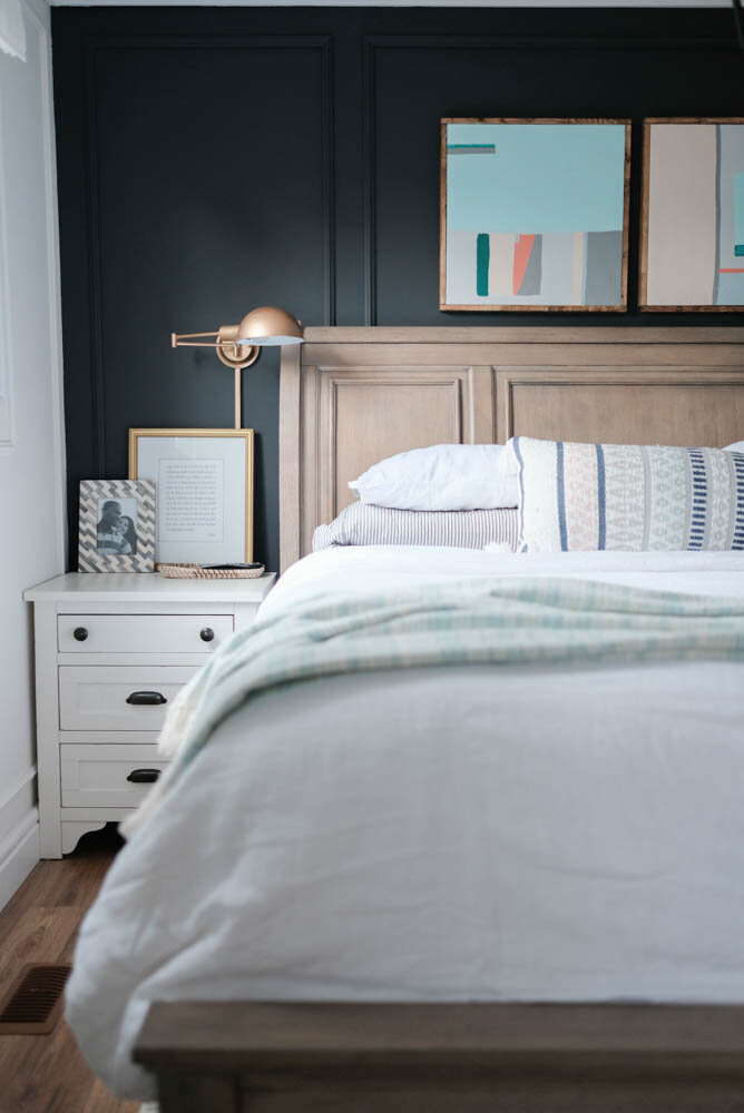 The art above the bed was a really easy DIY where I turned two thrift store canvases into abstract pieces. Check it out!
The Neutral Boys Room
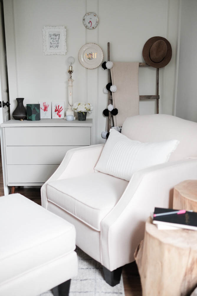
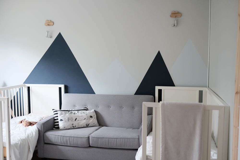
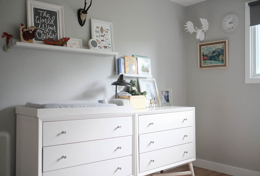
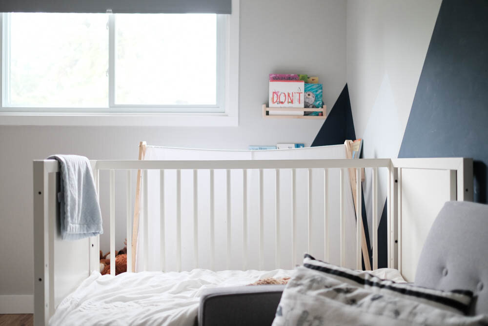
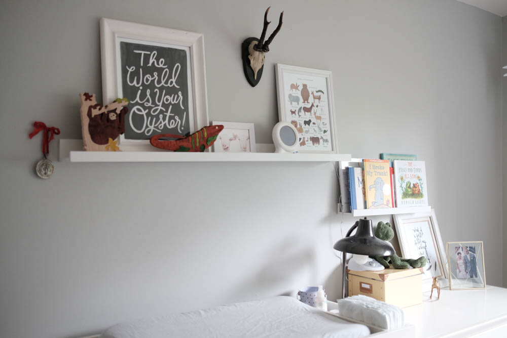
This space is about to get a makeover in the next few months as the boys are outgrowing their cribs. Sad, but I'm pretty sure they're ready for big boy beds, so let's take a peek at these cribs while they're still in here!

 And that's all for this very photo-heavy post! I hope you liked seeing a little tour of our home!Until next time!