Newly Updated Gallery Wall Around The TV
Bonjour mes amis! Greetings from Paris! How is it over here you ask? Uhhhh... I don't know yet because I'm writing this post on April 6th, but you can see for yourselves what our travels are like on Instagram, and by checking out our hashtag #MurraysInEurope! Alright, time for this gallery wall! Get ready for a lengthy (and full of images) post!!
 You might be thinking... "ANOTHER gallery wall?"
Nope... this is the same one! Just freshly updated after weeks of looking like this:
 I mean.... whaaaaaat? That TV is covering up your chalkboard, Thalita. Can't you see that?
Yes, you guys... I saw this. In fact, I saw it for a loooong time...but I couldn't change it until I knew exactly what I wanted to do with this change. It became obvious that the big green monster and the TV were not going to be moved from this spot, so it was time to commit. I even sketched it out. If you follow The L.O. on Facebook, you might remember these:
 These were part of step #1 to committing to making this change. Step #2 was getting new artwork to cover up more of the wall. It also needed to be bigger because too many of the small frames would look a bit strange with a large TV on the wall.
That's where the map of France comes in! It's large and would make a perfect addition to this wall in need of some colour, too!
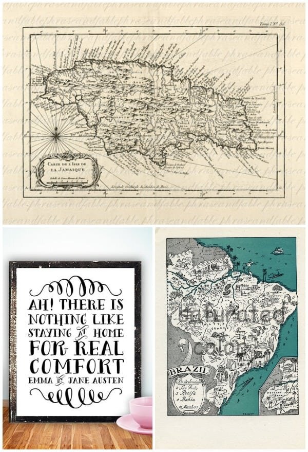
 There were a few other added frames as well. I purchased some new art on Etsy and had them printed at Black's on 8x10 matte paper and can I just say... I am in LOVE!!
 [Map of Jamaica: Phrase and Fable] [Austen Quote: Printable Wisdom] [Map of Brazil: Saturated Color]
The quote I just happen to love, but the maps are significant of the countries in which Alex and I were born, so I wanted to add those into the mix.
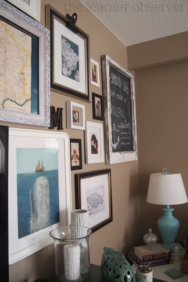
You ready to see what this wall is all about now? Here is a before, during and after shot:
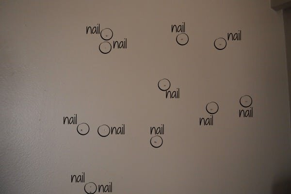
 I'm just a little bit on love with it. By a little bit, I mean a lot! I stared at this wall for a loooooooong time once I finished it. The thing with this time around is I didn't plan it as well as I did the last time. I just started nailing nails to the wall and hanging stuff. So my wall looked like this...
But the result worked out quite well and all of the holes were hidden! WIN!!
Oh hey, wanna see a GIF of the gallery wall progress? Ok good because I made one!
 Yes, this living room has seen some changes in the last year or so!Now let's get to some other details on this wall...The wooden frame with a painting of a ship on it was a thrifted find. I believe it was a whopping $4.99, and though I originally intended on just using the frame, Alex liked the picture so I took his suggestion of keeping it. So glad I did! I also love it now. The clip on the Austen quote was a Crate and Barrel purchase. Umbra makes them, and I love how they look!
 The cameos stayed. I really couldn't imagine them anywhere else, and I do really like having them around! I mixed personal elements with some random artwork, so the wall doesn't completely have a "theme"... and I'm not sure it needs to, though part of me thinks that rabbit print should be somewhere else. Thoughts?
 The Moby Dick print is one of my favourites ever! It's been hanging out on our stair landing for over a year, but the colour seemed so right for this wall, as well as the size. I planned on adding it to this wall and even sketched it in when I started planning.
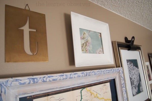
 The brass "t" definitely needed to stay... It's one of my faves, too! That 5x7 white frame was empty for sooo long, and the art that eventually made it in there was a portrait, so it wouldn't have worked here. I removed it and replaced it with a swatch of Tonic Living's Millie, Tutti Frutti because it is SO beautiful! Also, the colours on the fabric are perfect.
 The living room feels much more inviting and put together now, and it's almost like this room is... alllllllmost finished? Dare I say that?
 Alright... I think you've seen enough of one wall for the day, right?
I'd love your thoughts on this gallery wall, so pleeeeeease share them with me! What did I get right? What did I get wrong? Should I banish that ottoman from the room? How badly do my walls need to bad painted white? (The answer to that one is 'VERY badly') How do you feel about the whole off-center thing?I have a lot of questions... I'm sorry!Alright my dear friends, I hope you're having a lovely Monday so far! Sending you lots of Parisian love, filled with macaroons and croissants!xo


