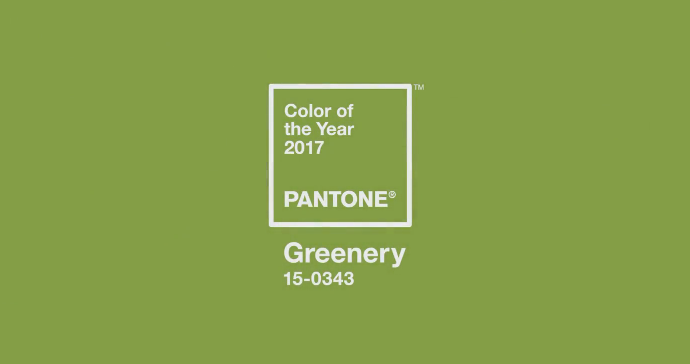
Talking About Colour with Pantone Greenery

It's no secret to anyone that I am a black and white lover and advocate. It's everywhere in my house and I never tire of it. Why? Because I can choose to add colour whenever and however I want, and it never clashes! You'll be seeing more colour in our home this year as we eventually focus on areas like the laundry room and back door as well as the master bedroom, but today I wanted to give you some ideas on how to use one very specific colour: Pantone's Greenery.
In case you're not aware, Pantone chooses one colour to be representative of every year. Last year there were two (the softest blue and pink combo) and this year it's a fresh green called Greenery. How appropriate. Here's what Pantone has to say:
Greenery is a fresh and zesty yellow-green shade that evokes the first days of spring when nature’s greens revive, restore and renew. Illustrative of flourishing foliage and the lushness of the great outdoors, the fortifying attributes of Greenery signals consumers to take a deep breath, oxygenate and reinvigorate.
Doesn't that sound lovely? Though admittedly, at first glance this colour can look a bit scary, especially for neutral lovers like me! The good news is that there are so many ways to freshen up your decor without letting the colour take over. Here are my favourite picks for bringing Greenery into the home:

ONE - TWO - THREE - FOURFIVE - SIX - SEVEN - EIGHTNINE - TEN - ELEVEN - TWELVETHIRTEEN - FOURTEEN - FIFTEEN - SIXTEEN
Not too overwhelming after all, is it? So tell me, would you use this bold hue in your home? And if so, how?
Until next time, friends! Oh, and yes, this post was sponsored by Wayfair. Because I heart them!

