Spring Home Tour
'Tis the season, my friends! Time to pull out the rainboots and put away the parkas. To watch little blossoms pop up from the ground and enjoy the beauty of Spring! But we don't need to only enjoy it outdoors, we can have a bit of early Spring indoors and change the decor from Winter to Spring. So let's see what's up in the Murray household!First of all, you'll notice the living room has changed significantly since the last time I posted about it, which would have been Christmas! We've started implementing the changes we originally talked about in this post about floor plans and chairs, and we added an office corner already, which has been a big game changer!Anyway, I'll stop talking about it and just show you!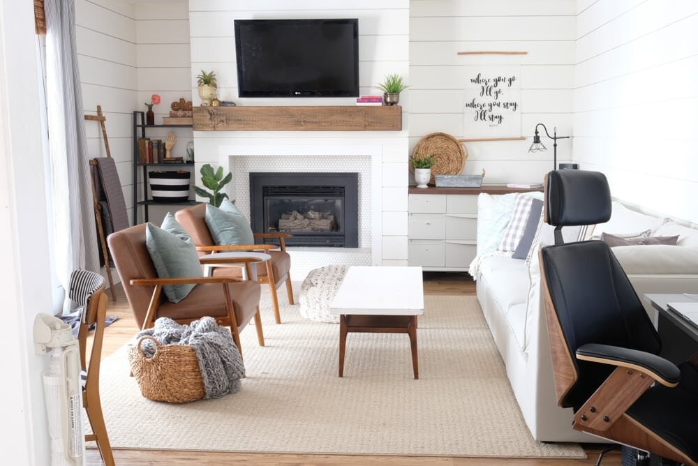
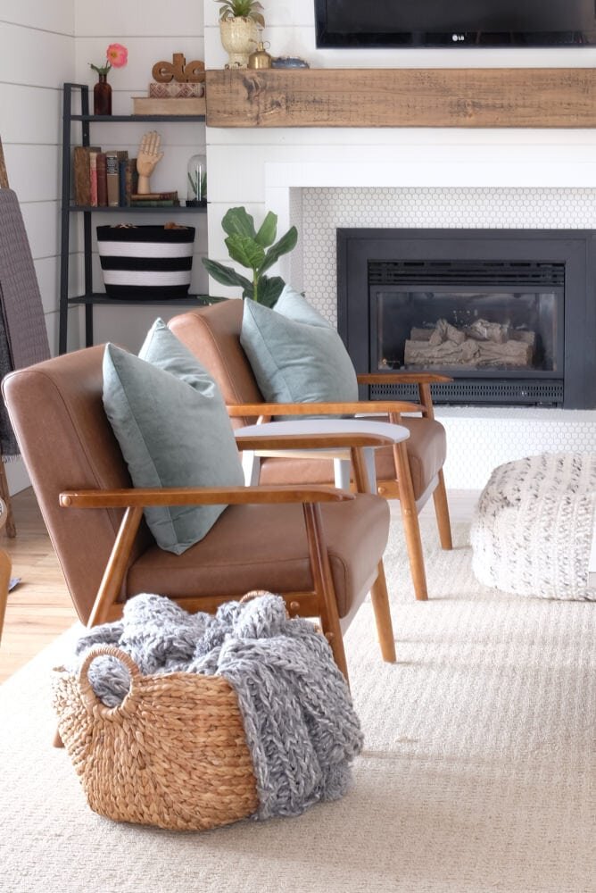
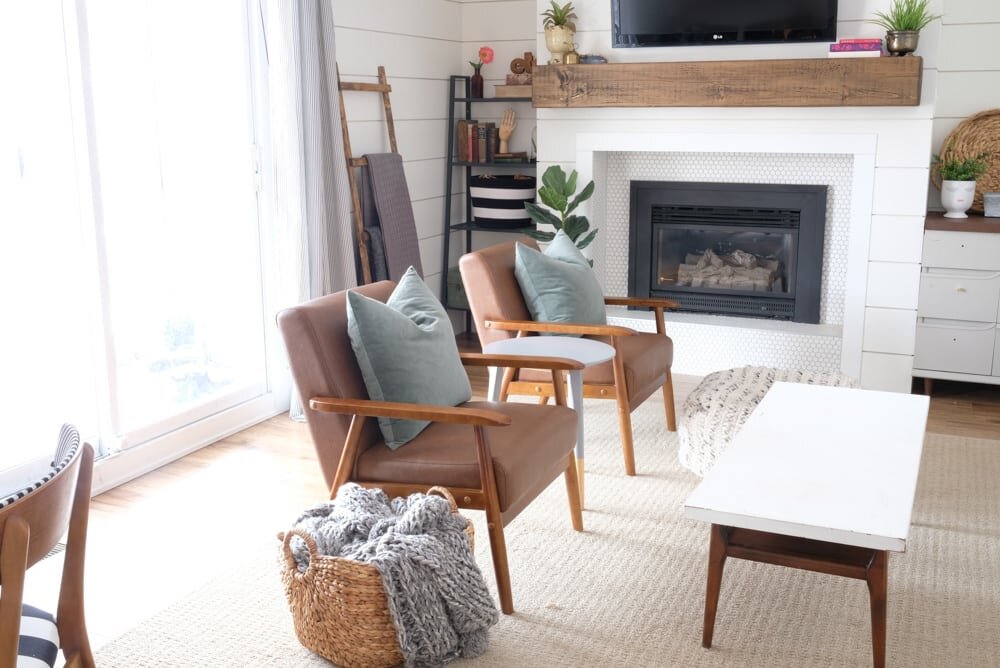 There is still work to be done in here, and I hadn't even styled the tables when I took photos because I was too excited, but I'm loving how these chairs look in here and how the colours have warmed up the space while making it look bigger because they're shorter and leggier than the previous chairs. And as you can now see, I went for the chocolate leather chairs from Wayfair, which I really do love!
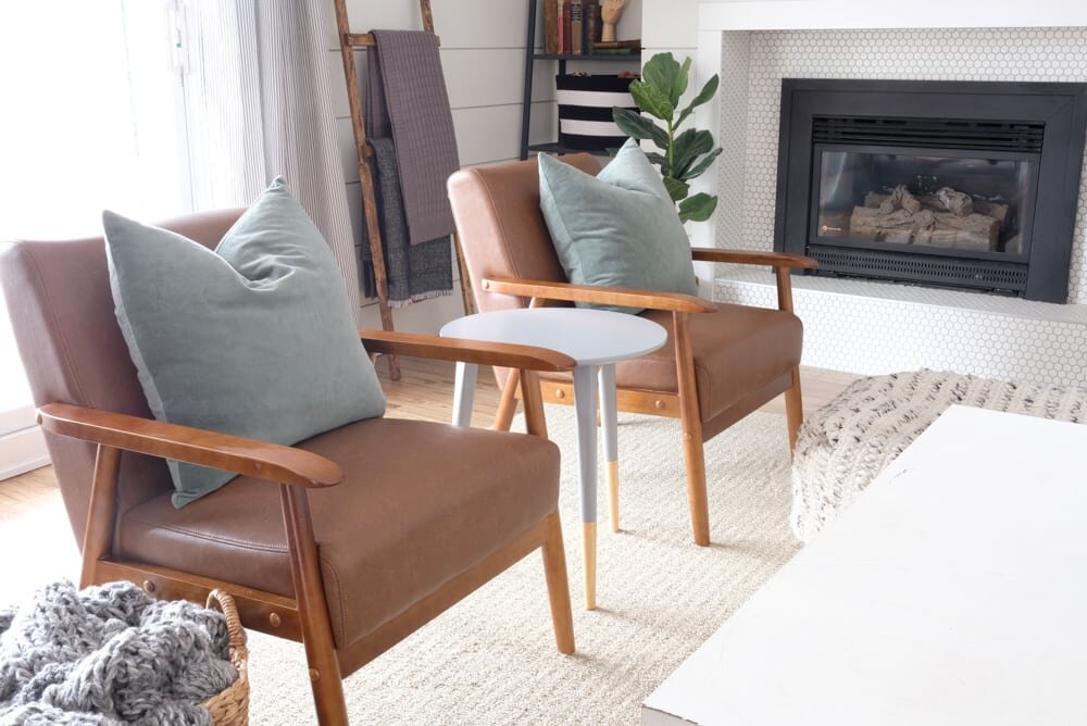 You know when you walk into a room and you think: "wow, this space finally looks and feels like me!" That's how I feel now. And what a great feeling it is!!!I'll post a full living room update soon, once the artwork above the couch is finished, but for now, I'd say this is a MAJOR sneak peek at what the room will look like since it's like 90% finished.
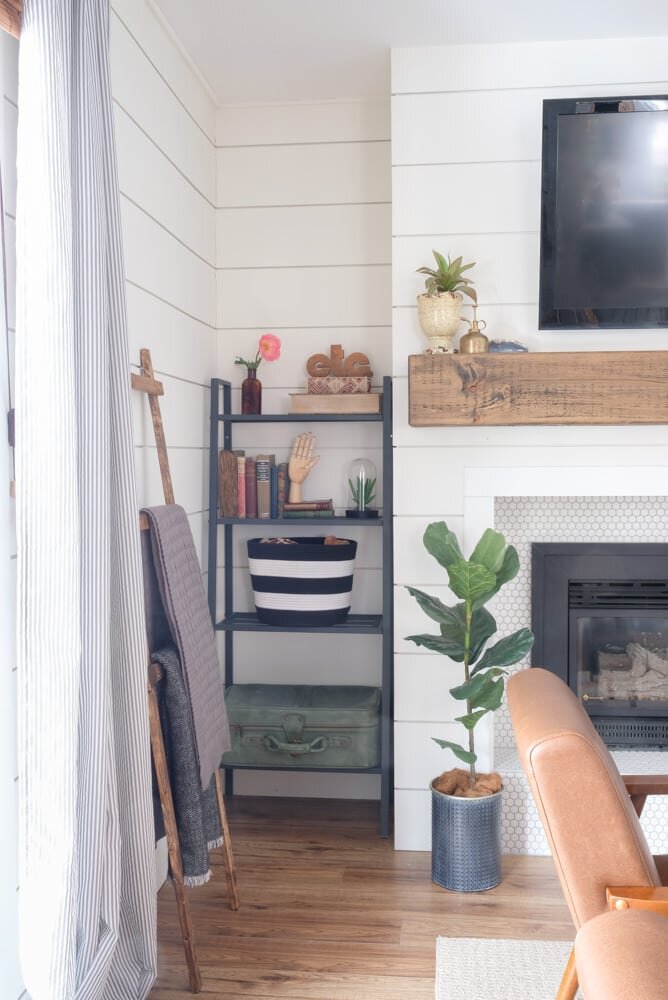
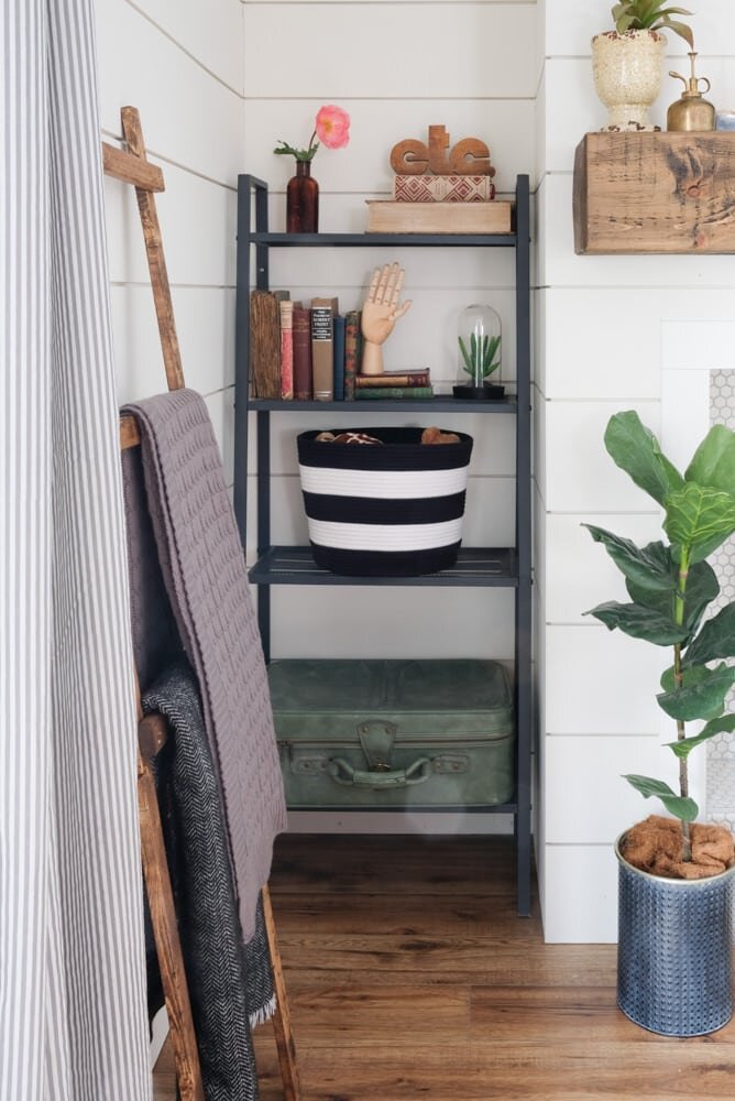
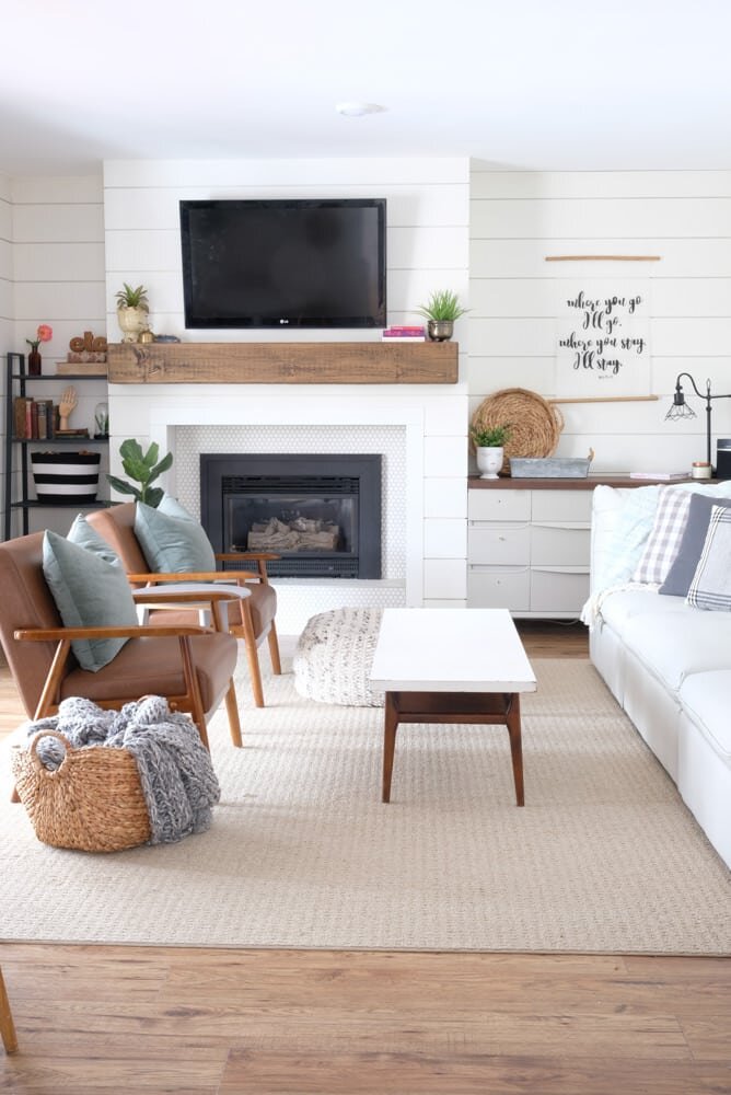 We've changed things up on either side of the fireplace, and though the dream is to eventually have built-ins here, the dresser and bookshelf are looking pretty darn good as stand-ins.
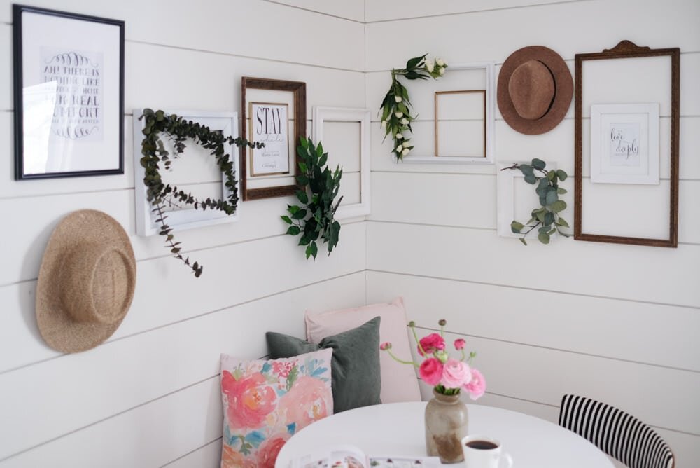
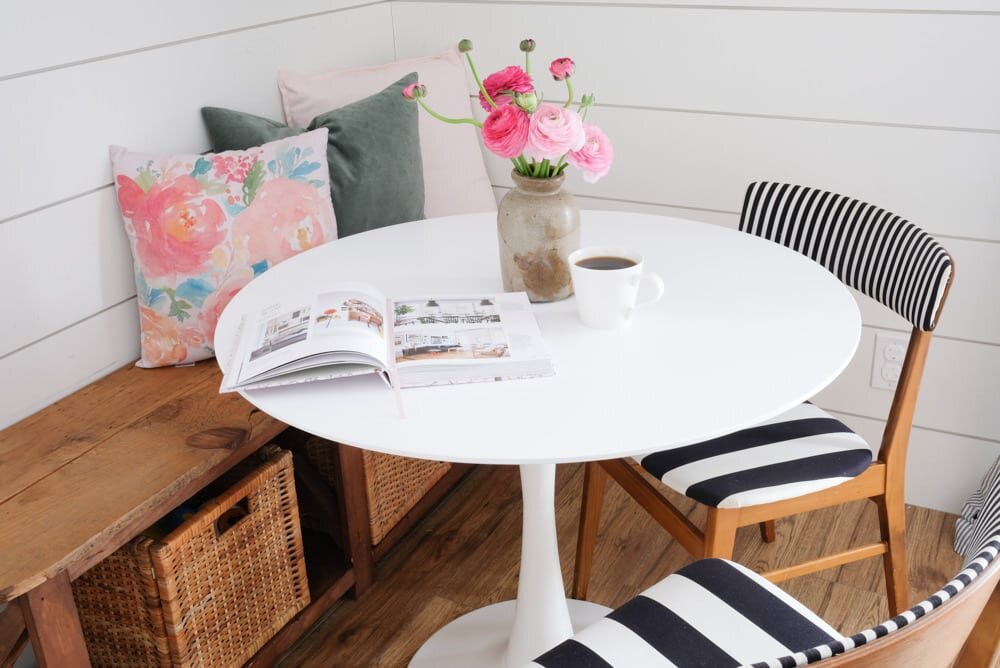
 Over on the other side of this awkward room, we added in a tulip table and bench for a sitting area, which is great when I want to work in there, or even for the kids to sit at and build with blocks, colour, or for me to occasionally drink a hot cup of coffee!
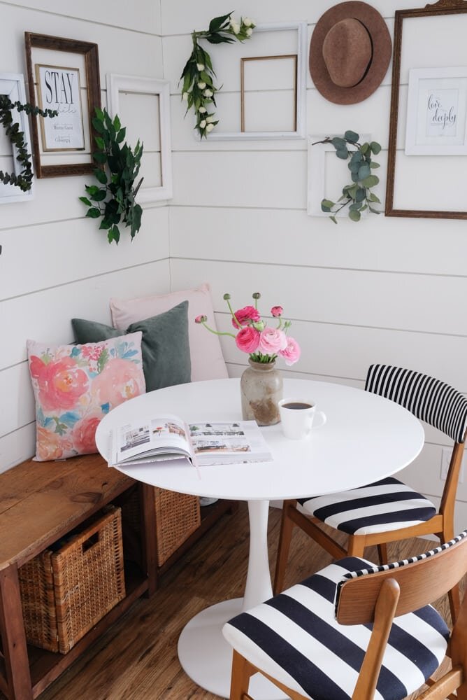 One of my favourite things about this corner are the frames on the walls. I made these a few months ago, and they had been above the couch for a while, but this is a much better place for them. We have our wi-fi password here, and a couple of little saying we like to remember daily.
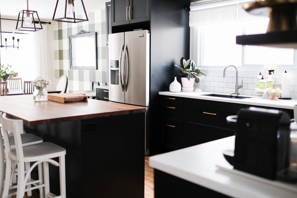
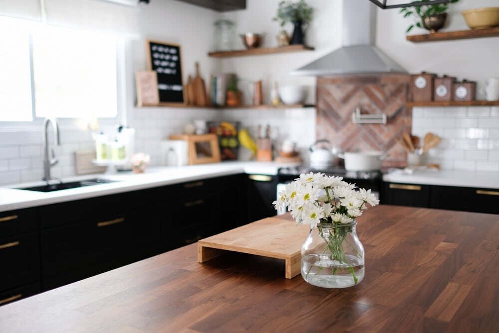
 In the kitchen, not much has changed. The shelves are a little simpler, and I'm doing my best to keep the surface of the island as clear as possible since out countertops already feel so cluttered sometimes with things we use daily. It's a battle to find the balance between pretty and functional, sometimes!
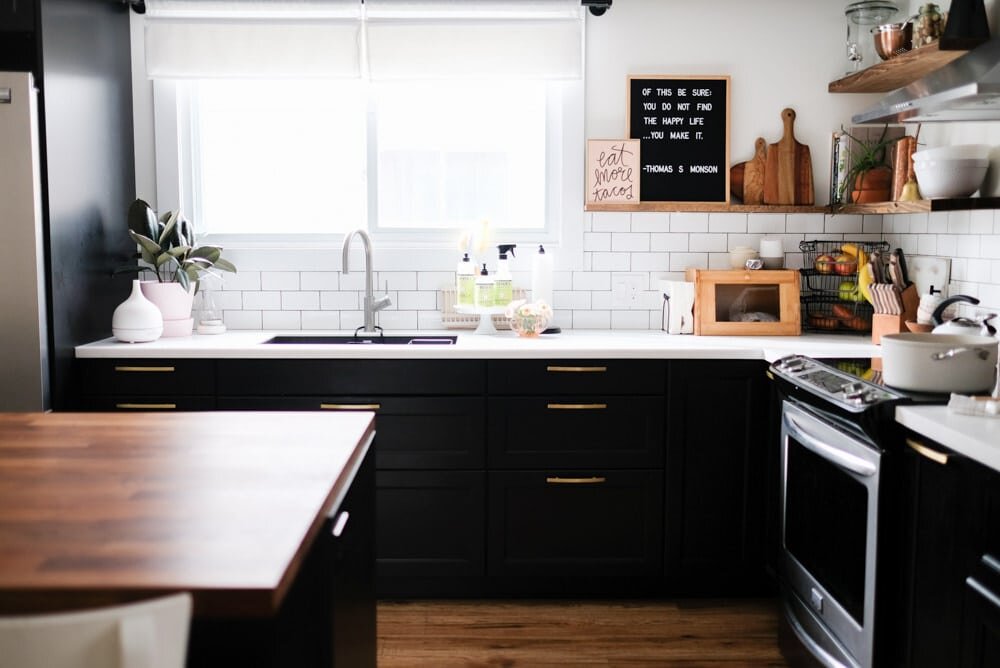
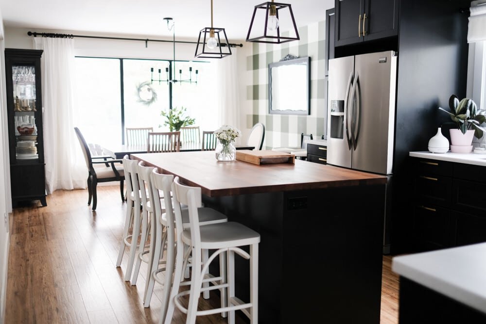 You may have noticed there's a wreath on the dining room window... Winter hasn't fully left us just yet! We may or may not still have an urn and lights hanging around outside...But back to the kitchen...
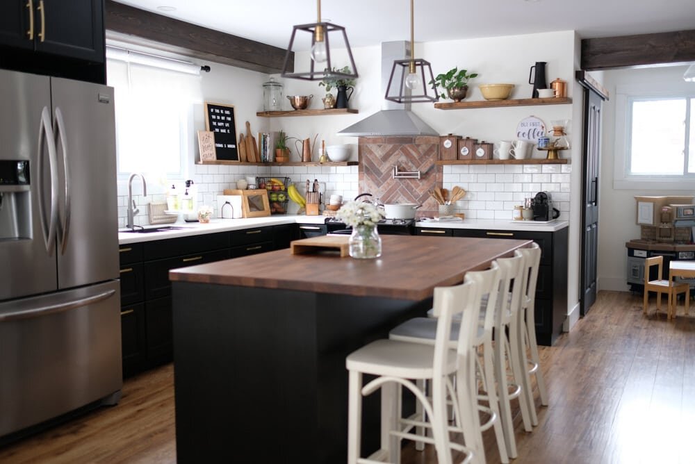 I think this is an angle of the house I haven't shown before, and it gives a really good idea of the layout of our main floor. You can see a peek of the green and pink rug at the front entrance.
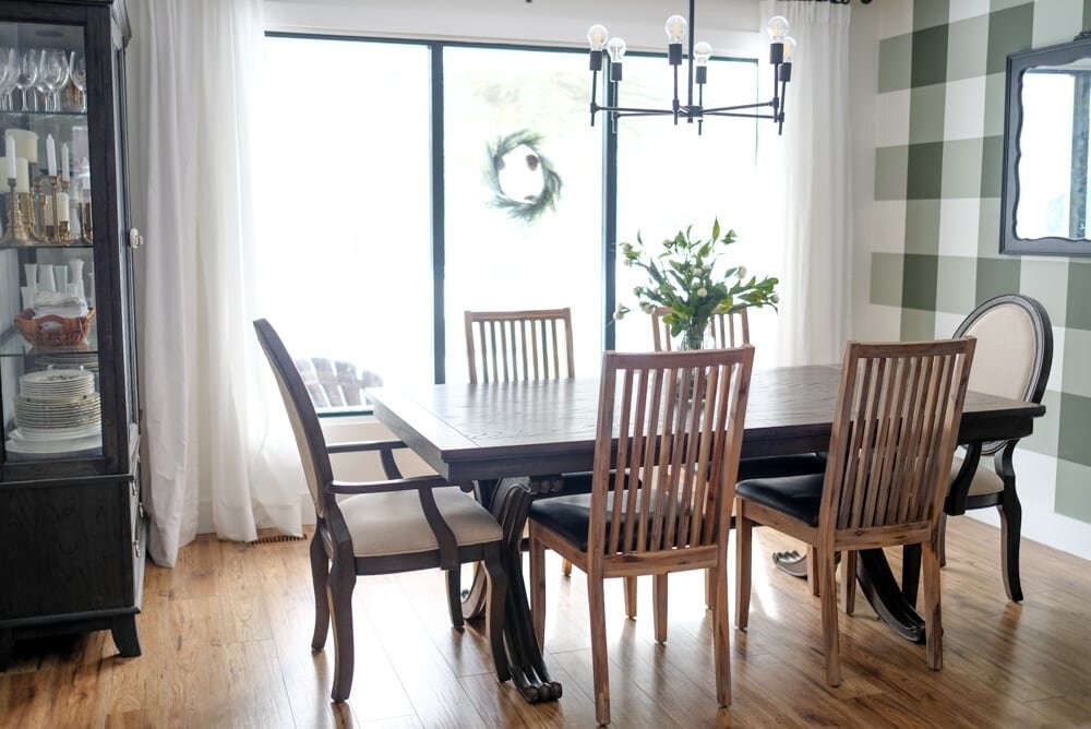
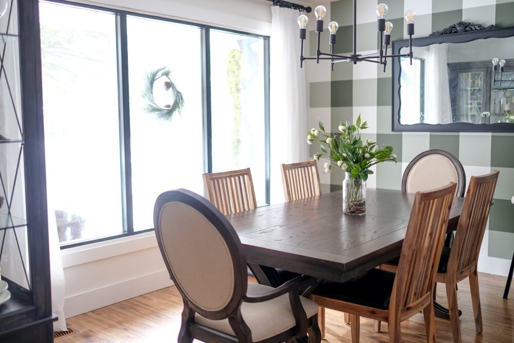
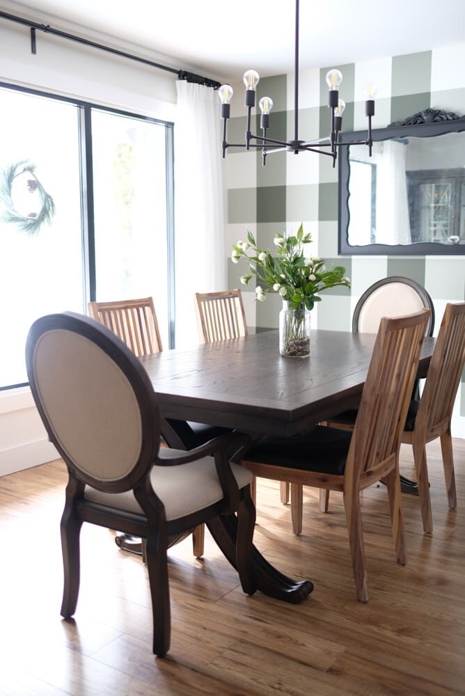
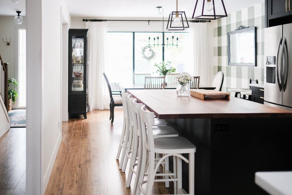 Now as for the dining room, this is a space that constantly remains in simplicity because we actually use this table every single day! A vase at the centre is about all I can manage up there, or the kids are all over it!
 And there you have it! These are a few of the ways we've simplified for Spring, and it's definitely a bit more of a "keep it real" home tour since very little of it is styled, because toddlers make that pretty darn hard!Now, if you like home tours (and I have a feeling you do), then you'll LOVE this... There are 4 more tours you can see today, and a whole bunch you can check out this week. The lovely ladies of The DIY Mommy (Christina) and Home Made Lovely (Shannon) put this tour together, and I'm so thankful for all of their hard work, and to everyone else who is participating in the tours this week! Check them out!
Monday
Home Made Lovely | A Pretty Life | The Happy Housie | Life is a Party | This Mama's Dance
Tuesday
So Much Better With Age | The Dreamhouse Project | The Learner Observer | A Burst of Beautiful | Woman in Real Life
Wednesday
Clean and Scentsible | Paper Rose | Harbour Breeze Home | Emmett's ABCs
Thursday
The DIY Mommy | Mint Candy Designs | Rambling Renovators | The Creek Line House | PMQ for two
Friday
Kim Power Style | Northern Style Exposure | Vinyet Etc | Amidst The Chaos | One House 2 Barns