Grey and White Kitchen Renovation
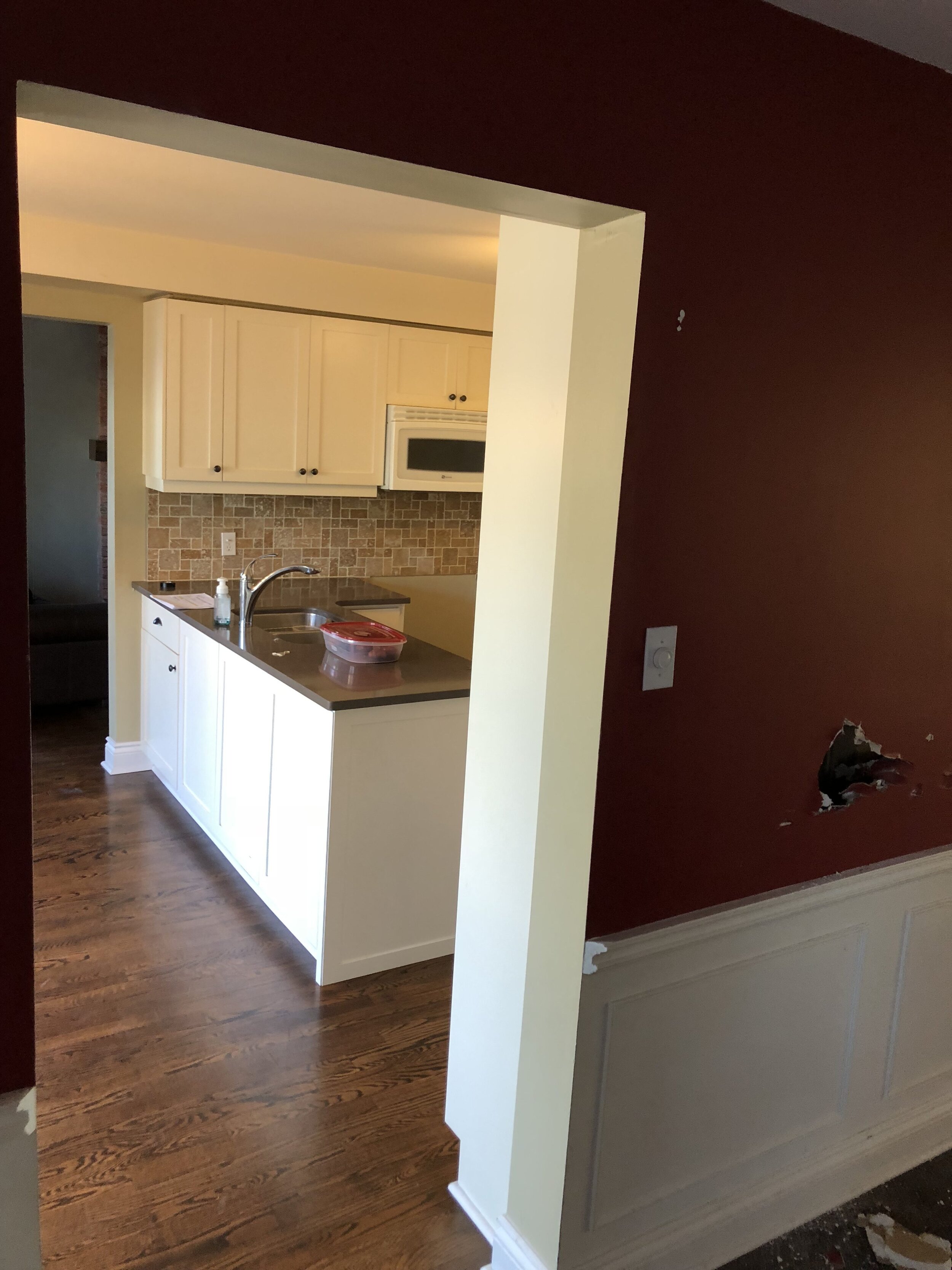
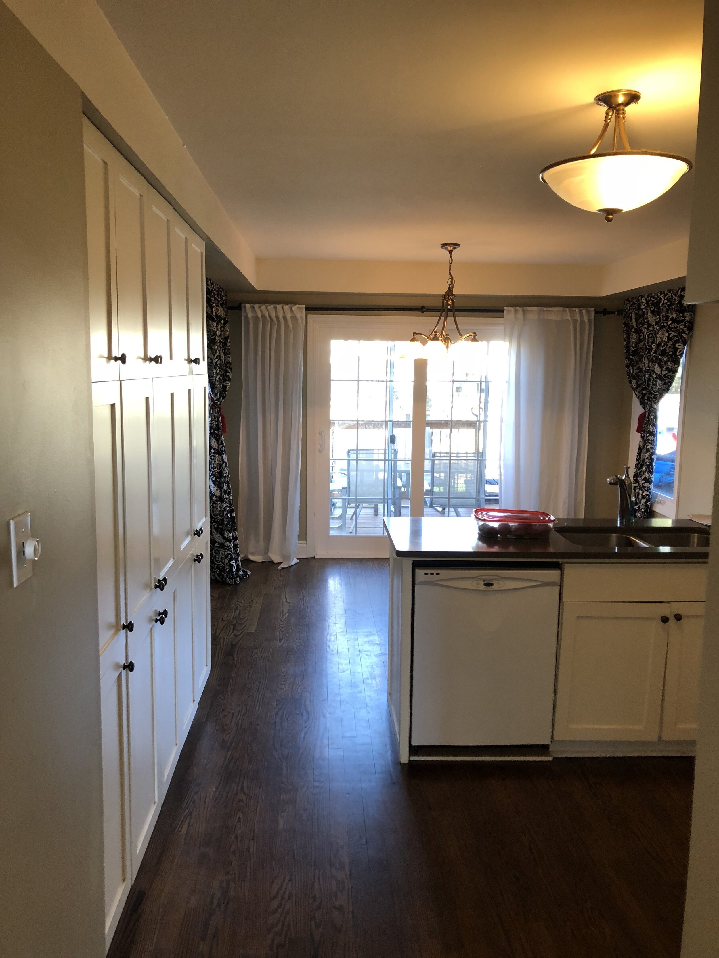
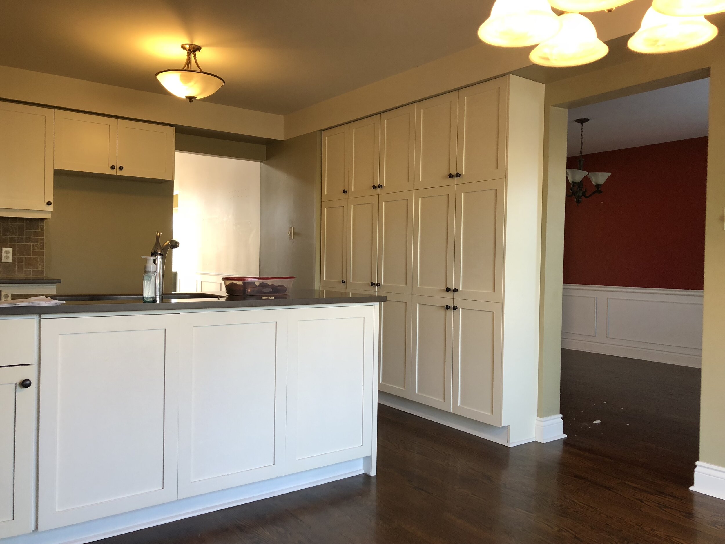
I basically could NOT be more excited to be sharing this post with you all today because this was my very first project completed with The Brolaws, and and we got to partner with Metrie, which was truly like a dream come true. This grey and white kitchen renovation quickly turned into an entire main floor reno and now includes a staircase makeover as well.If you didn't know that I offer design services, you do now! It's not something I haven't talked about much here on the blog, but that's about to change. For now, let me share some of the fruits of our labour over the last few months: I mean......seriously!Now let me go ahead and show you the 'before' photos so you can see what a true transformation this was!
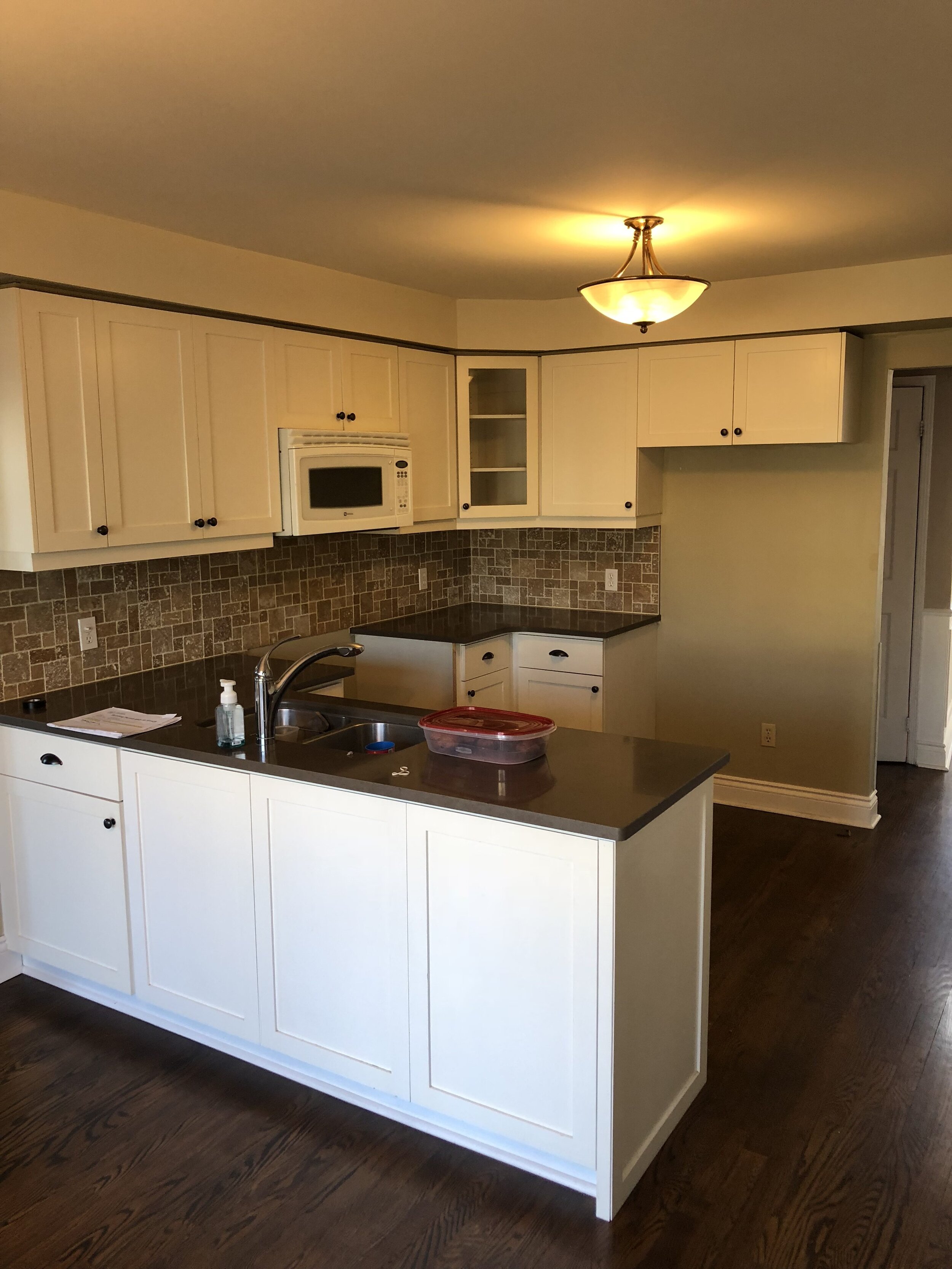
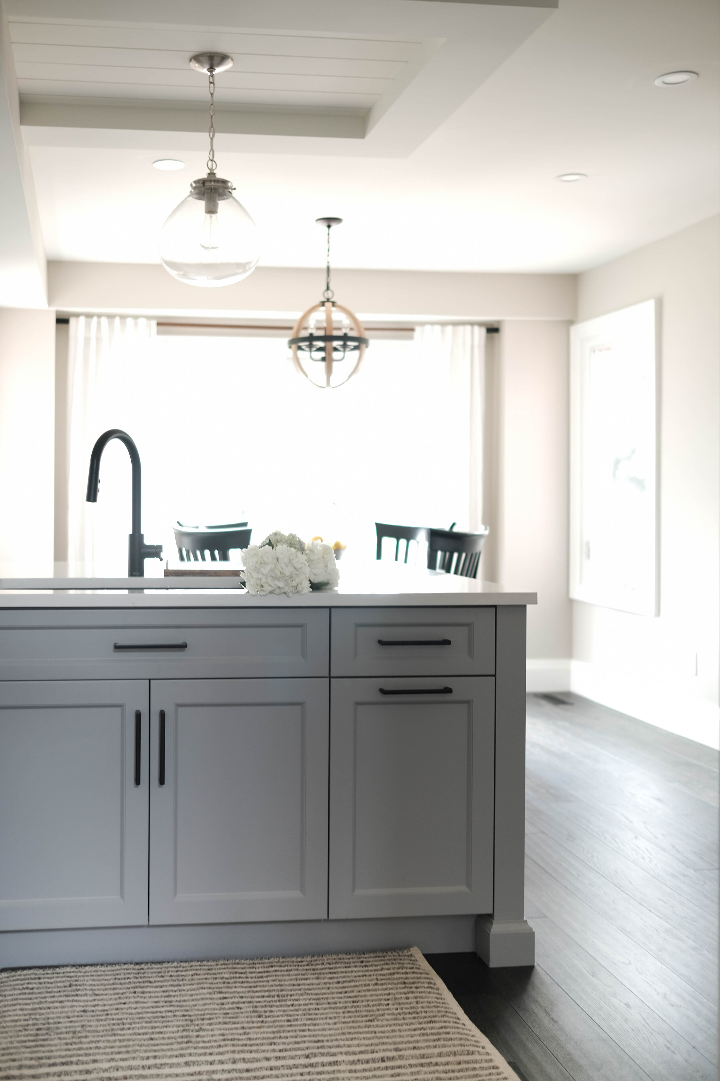
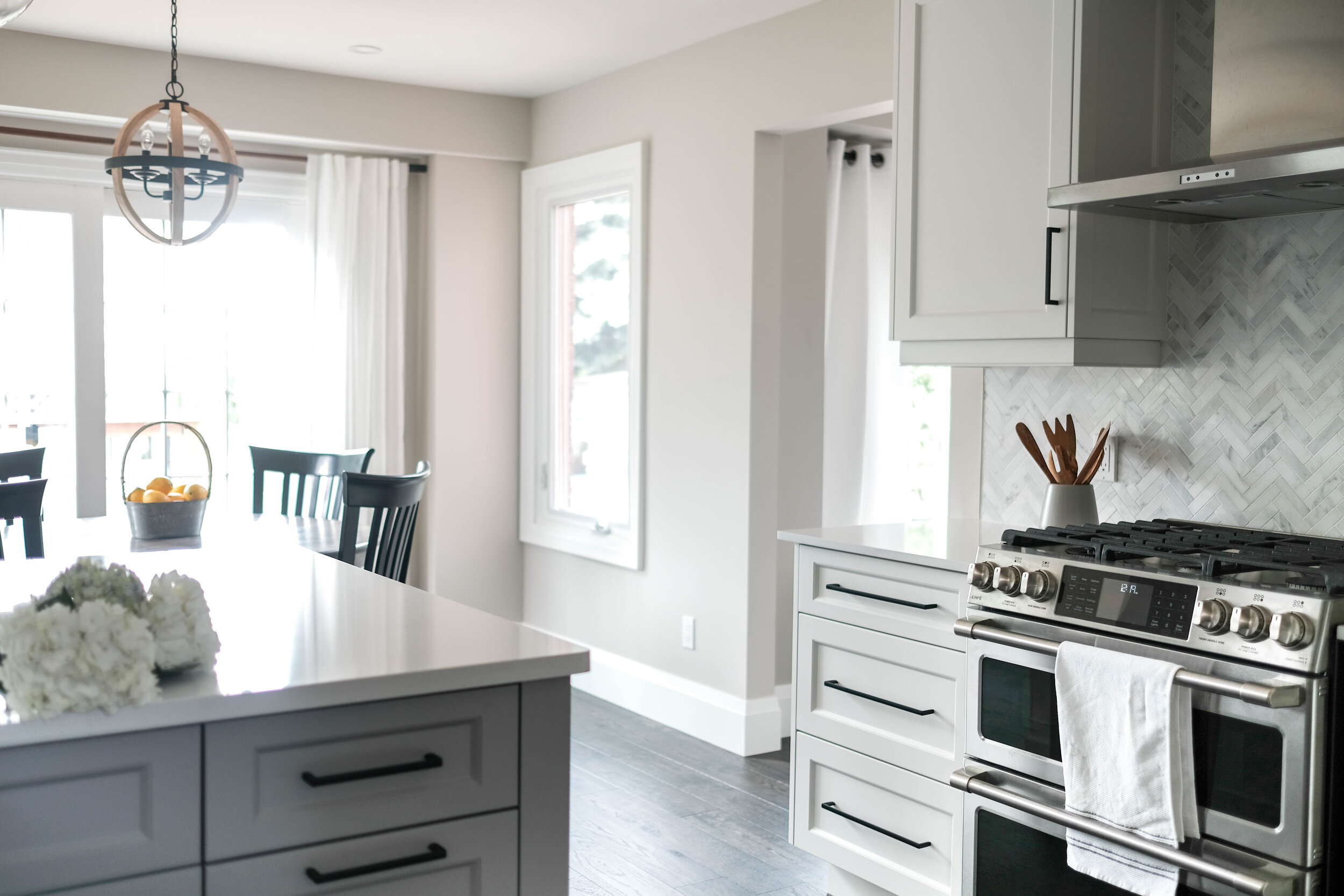
 The kitchen was impeccably designed by RocPal, and the countertops are Silestone Eternal Statuario, purchased from Renovare. We went with a 2cm profile along the perimeter and 3cm on the island, but both are in the same finish. The cabinets were painted in "White Dove" by Benjamin Moore, and the island is "Stormy Monday." On the walls is Sherwin Williams "Modern Grey" and the trim and ceiling are BM "Simply White."The house originally had a living room & dining room combo at the front of the house, and the kitchen and family room at the back. The dining room became a part of the kitchen, with a desk area for the family to work from, and the front living room is now the dining room (which I'll share when it's finished).
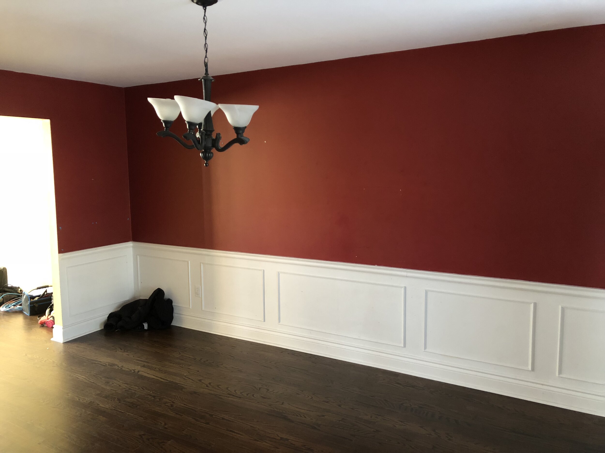
 And can we talk about all of this incredible trim for a second? We went with Metrie's Option {M} Modern Farmhouse line (7 1/4" baseboards and 3 1/4" casings). They are perfect in the space, and run throughout the home now. Adding the casings to the dining room openings made all the difference, as the room now feels slightly more separate from the kitchen and entry, though it's a fairly open floor plan.
 The addition of a butler's pantry (which has a full built-in pantry across from it) was so great to create a transition space from the dining room to the kitchen.The peninsula was replaced by a 10' island. Yep. TEN FEET! It's quite a sight! We added in these Homesense stools with wooden seats to warm up the space, which was also why we chose a warm grey for the walls.
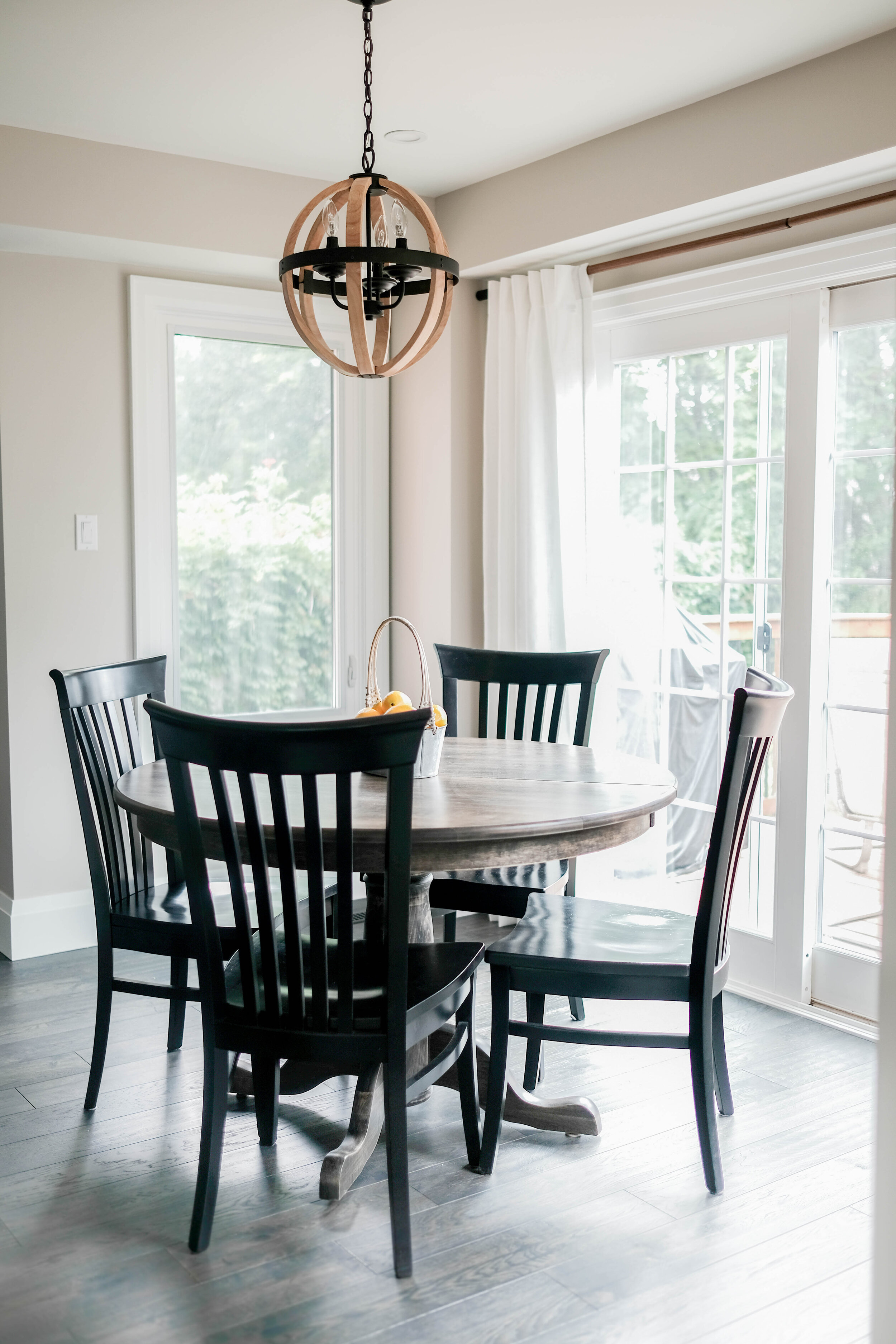
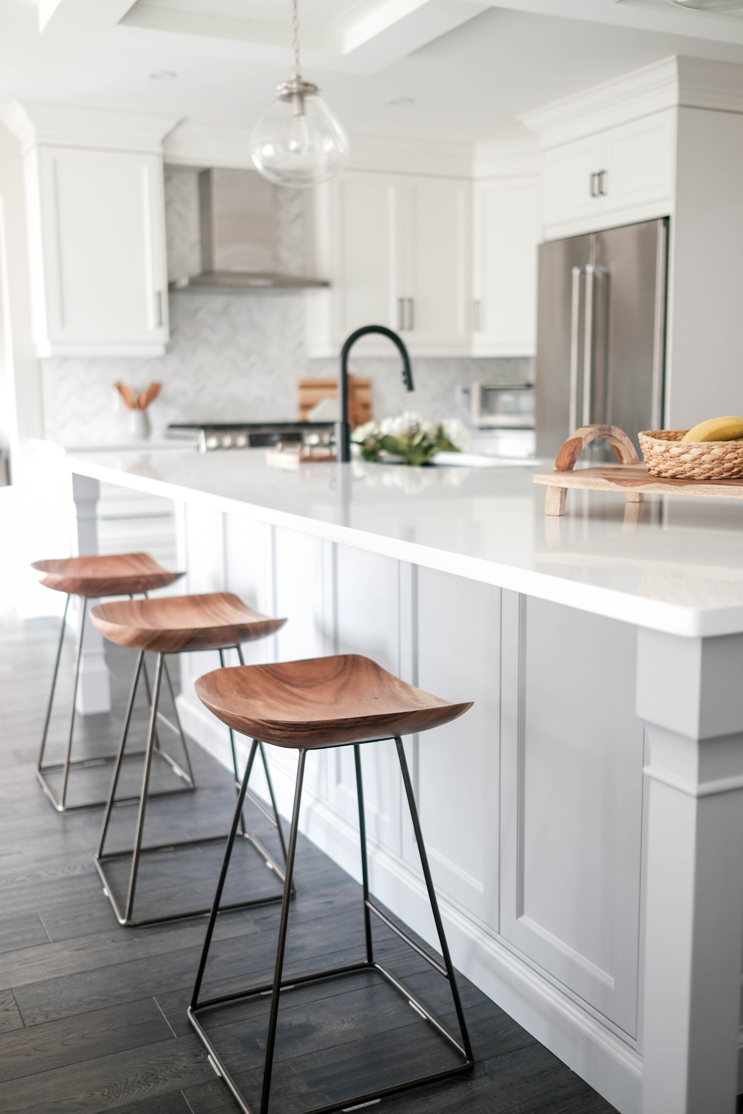 The matte black finish is repeated throughout the kitchen in the stools, the cabinet and drawer handles, the faucet, the breakfast nook lighting and the curtain rod (which is so gorgeous with the matte black and wood mix, also purchased at Homesense, made by Umbra).
 The homeowners also had their table and chairs (that they have had since they got married) refinished - the table went from solid black to a more subdued grey and the chairs got a new paint job. The whole set looks brand new and it was a genius way to save some money, too, especially because these are high-quality pieces.
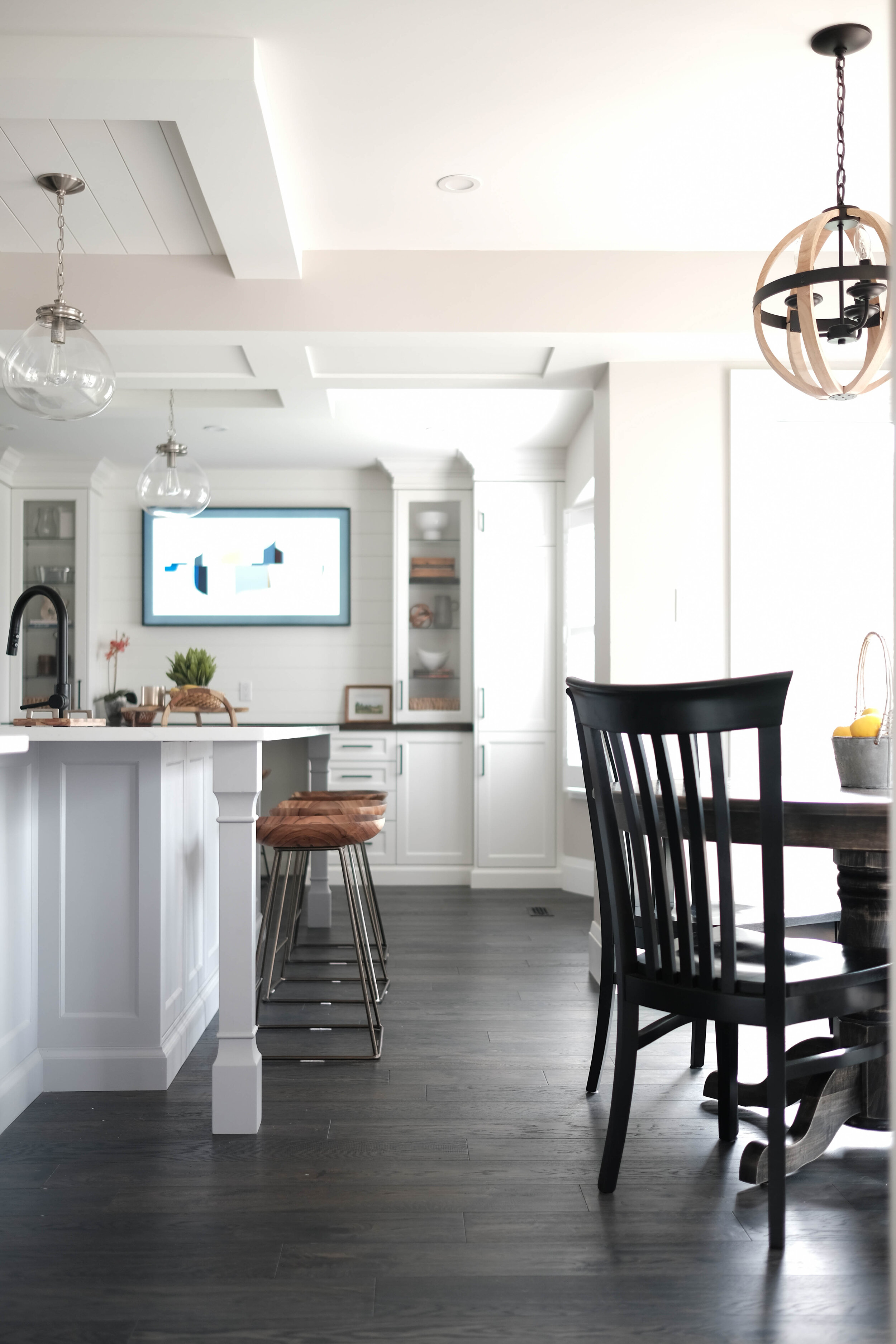
 To tie into the stainless steel appliances, the lights above the island have a brushed metal finish and are nice and subdued, letting the amazing ceiling work shine, which was created by Brian from The Brolaws team to camouflage a beam from that wall between the kitchen and dining room being taken down. They also repeated the shiplap seen on the ceiling in above the desk area, which I absolutely love.

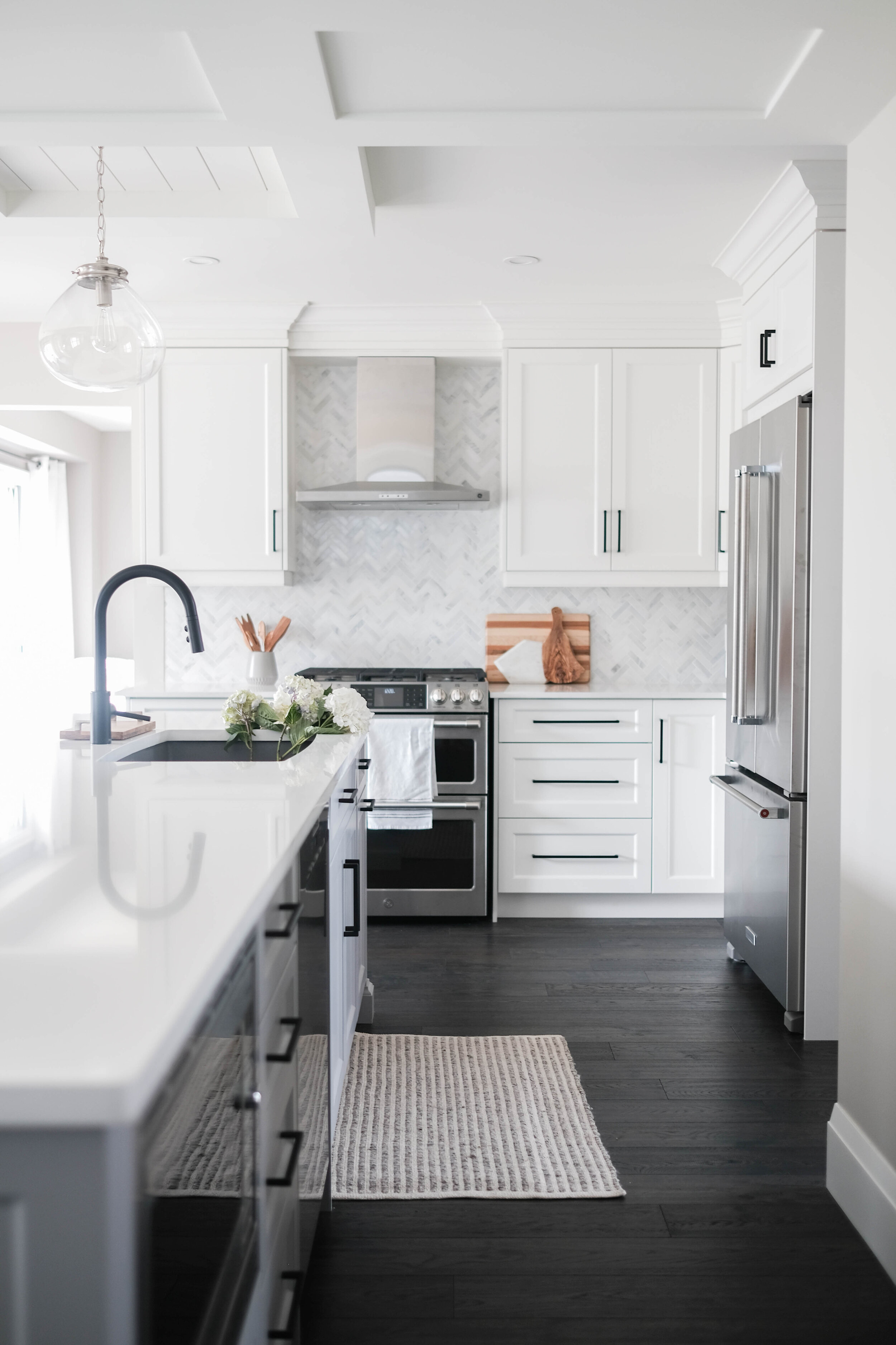
 Ok, now let's talk about this sink situation. We went with the Blanco Performa in Metallic Grey to tie in a lot of the grey in the house - you'll see what I mean when I share the entryway and powder room!
 Finally, the backsplash. This was the final decision for the space, and it's probably one of my favourite parts of this kitchen. The herringbone pattern is classic, as is the marble, so it was a win-win, and the small scale felt appropriate for the space, since there wasn't much backsplash, plus it's such a nice contrast to the grand scale of the kitchen itself.
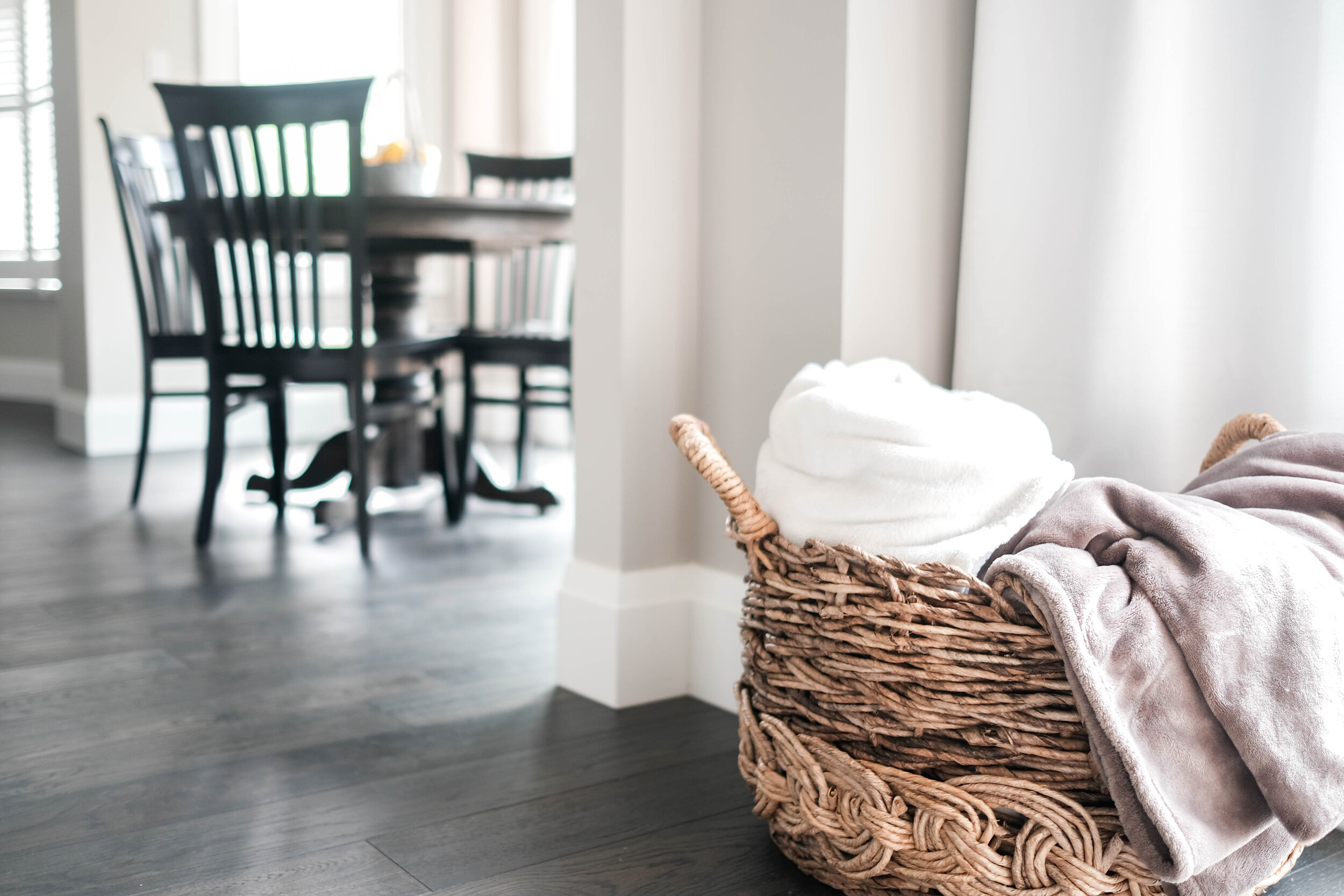
 What more can I say about this space, other than I am so proud of the work that's gone into it, of the hands that made it happen, and of the relationship built with this family, who was so lovely and wonderful. Truly, this is a project I will look back on so fondly, and it's not even complete yet!Now let me leave you with a peek at the family room next to the kitchen (and this insanely amazing basket), plus a few detail shots of the kitchen.


 If you want to get in touch with me about design services, feel free to email me [info@thalitamurray.com] or go check out my services page on my business site OR use my contact form!
