One Room Challenge: Powder Room (Week 6)
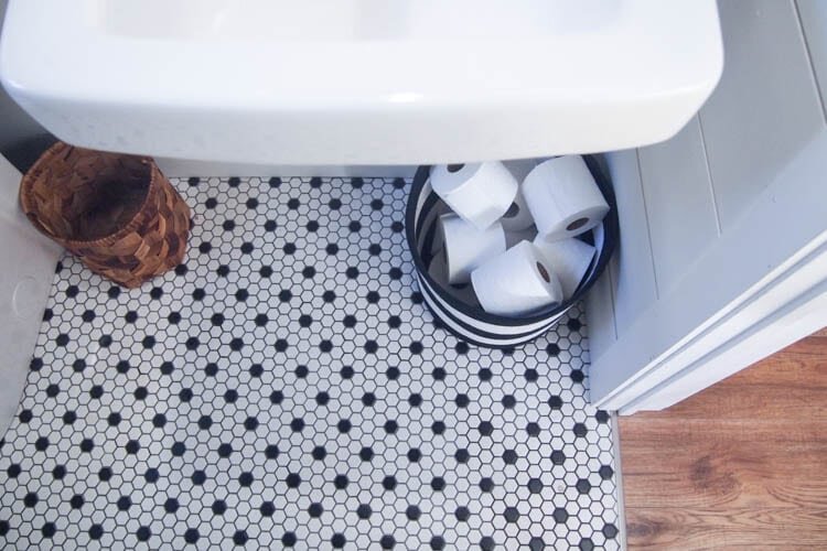
It's finally here. The day of the big reveal of the smallest room in my house! Can you believe it? I managed to paint and decorate a 70 square foot space in 5 weeks! Crazy, no?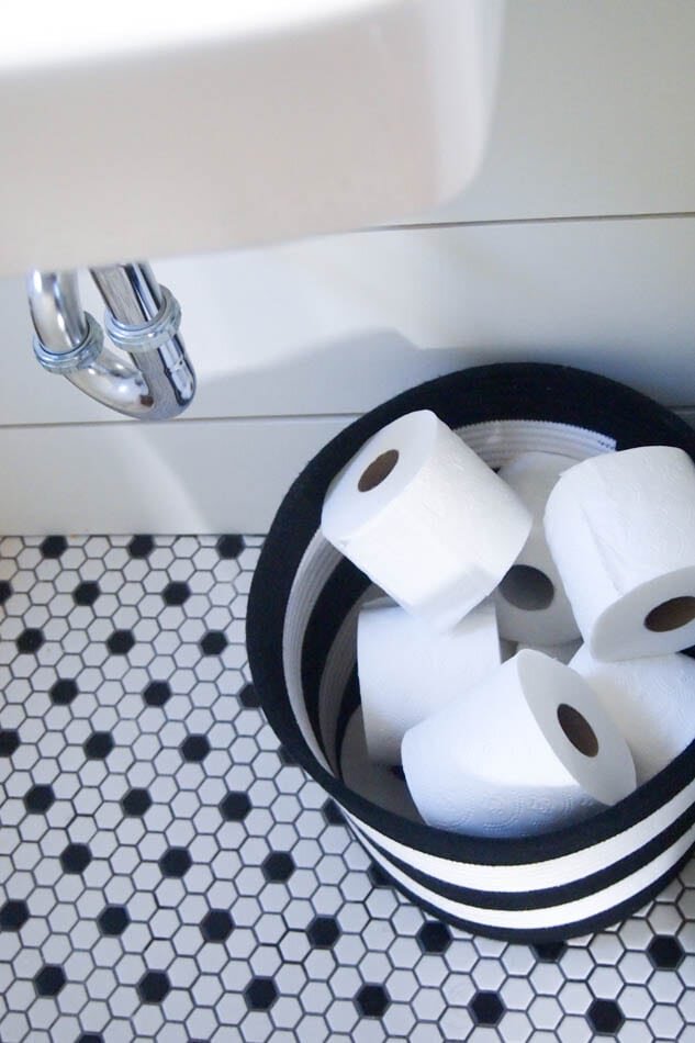 Yes, this is what you get first. A picture of toilet paper in a basket! Because there really isn't much to "reveal" here, you guys. Let's be honest!To make this a little more fun, let's go back to where we started, shall we? And if you're really curious about all of the progress, you can see all of it here:
Week 1Week 2Week 3Week 5 (that's right, I skipped week 4!)
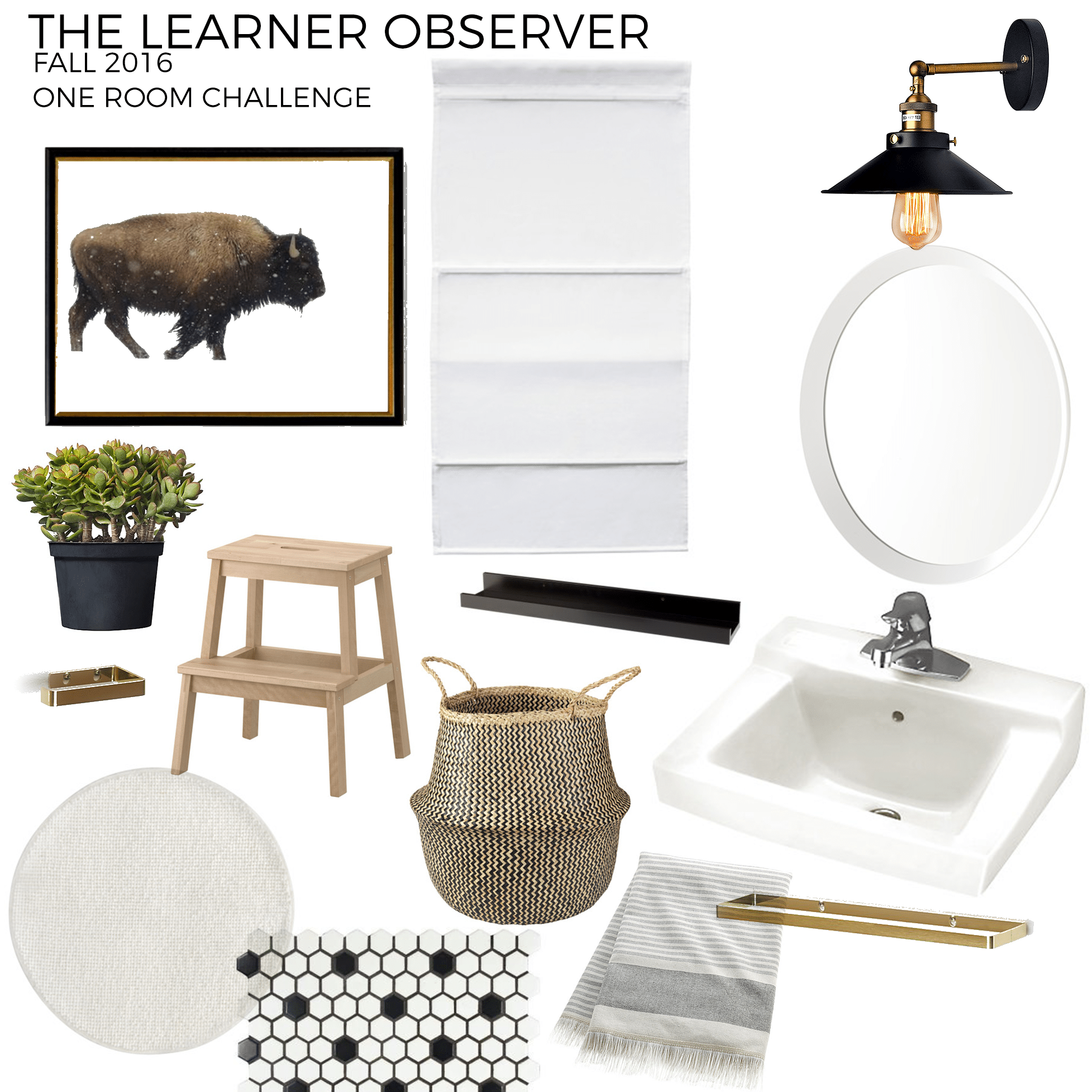
This was my inspiration/mood board for the room. You can let me know if you think I came close!
And this is the room when we had just gotten the house. The mix of finishes in here was really just to die for. And I mean just on the walls alone! And that scalloped detailing on really gets me, I probably should have kept that sink, huh? (ha!)

Remember that little beauty? And you can't even see the horrendous tile that used to live in here. Consider yourself lucky! Well, here's what our little powder room looks like today:
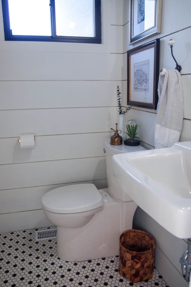
A bit of an improvement right? We said goodbye to stucco walls and covered them up with shiplap. We also got rid of the outdated tile and put in my favourite tile of all time (you'll remember it from our last bathroom and you may see it in our upstairs bath also!).
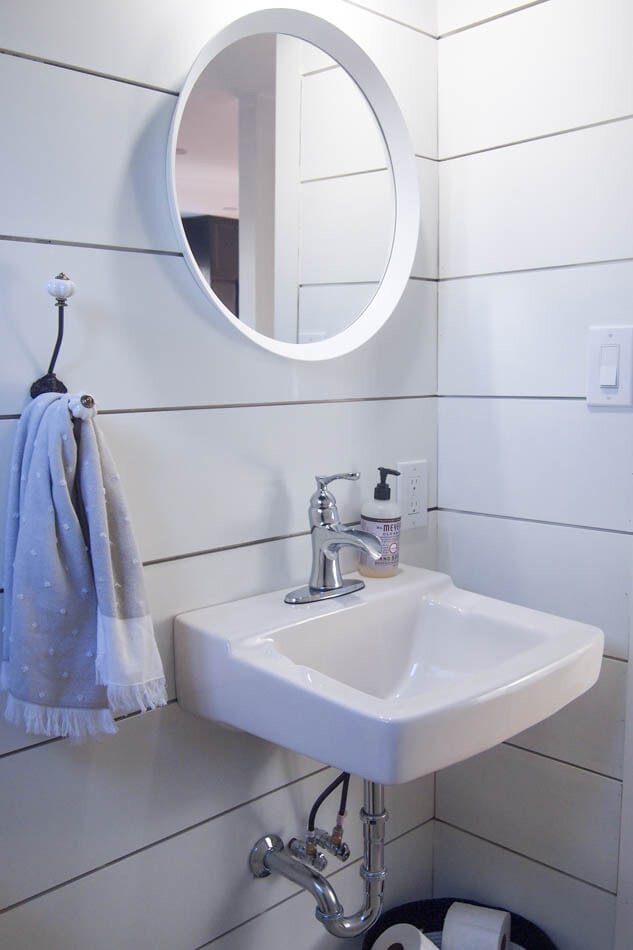
Because the room is so small, I opted to go without any cabinets and went for a wall-mounted sink. It makes a huge difference! Plus, we don't need a ton of storage in here anyway. As long as there's a basket full of TP, I think we're good, right?
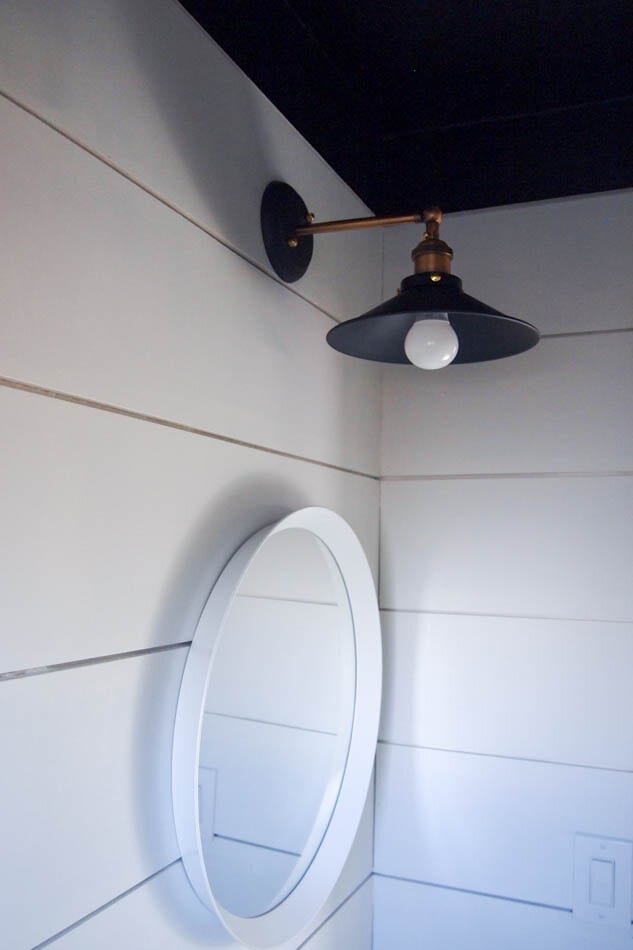
Up top we took out the crazy dated light fixture and went for something a little more timeless. It may not have a pretty Edison bulb in it (because who even uses those in a washroom? Hello! We need to SEE!), but I still think it looks mighty fiiiiiine!

And did you notice the black ceiling? Please tell me you did. Because you guys... black ceiling! I originally wanted the whole room to be black, but it's pretty dark in here (and SMALL!) so it may have made people slightly claustrophobic. Better that we stuck just to the top panel of shiplap and the ceiling.
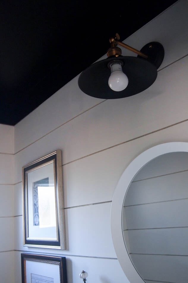
I'd be lying if I said I'm not obsessed with it, because I SO am! It may sound crazy to do something like this in the tiniest room ever, but I think it really works in here. People love to call powder rooms their little jewelry boxes (though I don't know why. That seems super weird to me), but this little room is a bit of one. It has texture and depth and lots and lots of metallic finishes!
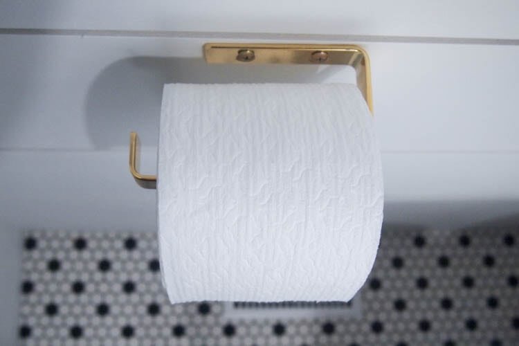
Yep. That's my toilet paper holder. How much toilet paper can ONE blog post have, you may ask? Don't worry. There's probably more. But really, can we talk about this perfect little golden nugget right here? SO. CUTE. Even for something that holds an unmentionable!
Seriously, though, I opted for lots of finishes because I love mixing metals and I hope that trend never ever dies.
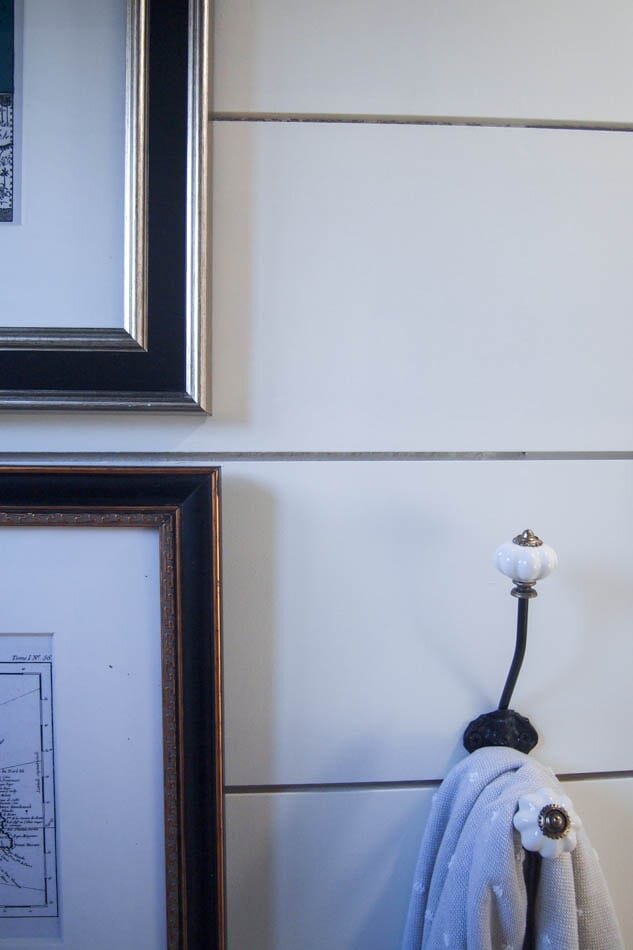
The framed maps in here are pieces I had from our last house. I know... it's not the buffalo print from my inspiration, but that wouldn't have worked here anyway because as it turns out, the perfect place for artwork in here was on top of the toilet, not across from it like I had originally intended! So this time, my lack of planning and ordering things worked in my favour!
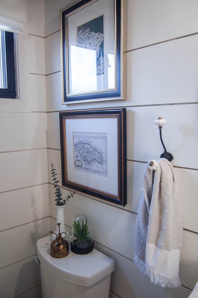
I did also have a gold towel bar that matched the tissue holder, but it just didn't work in here. I wanted to somehow super-hot-glue gun it to the bottom of the sink to make a towel bar underneath it, but it wouldn't have worked. I happened to have this hook that I found at a small shop a few years back, and wouldn't you know it, it worked out so well!
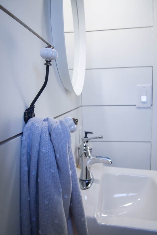
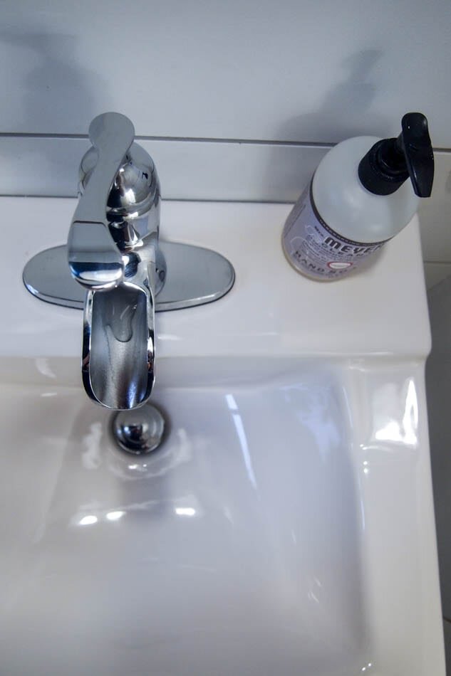
I love that the room feels modern but somehow classic and timeless also. I really mixed a lot of finishes and styles here, but stayed true to my black, white and gold (plus a hint of woodsy tones in the trash bin).
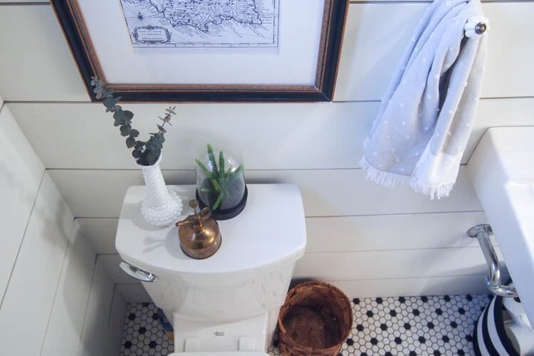
This completely neutral room isn't for everyone, especially those who like their jewelry boxes full of colour, but I say neutrals don't have to be boring. And if you looked in my jewelry box you'd see a lot of the same things you see here: black, white, mixed metals and a hint of natural elements!
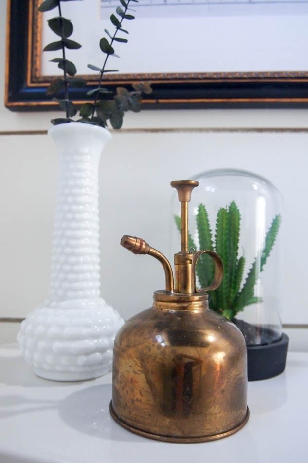
In case you're curious about where I bought anything, I linked as many as I could below. If you have any other questions, though, please ask!
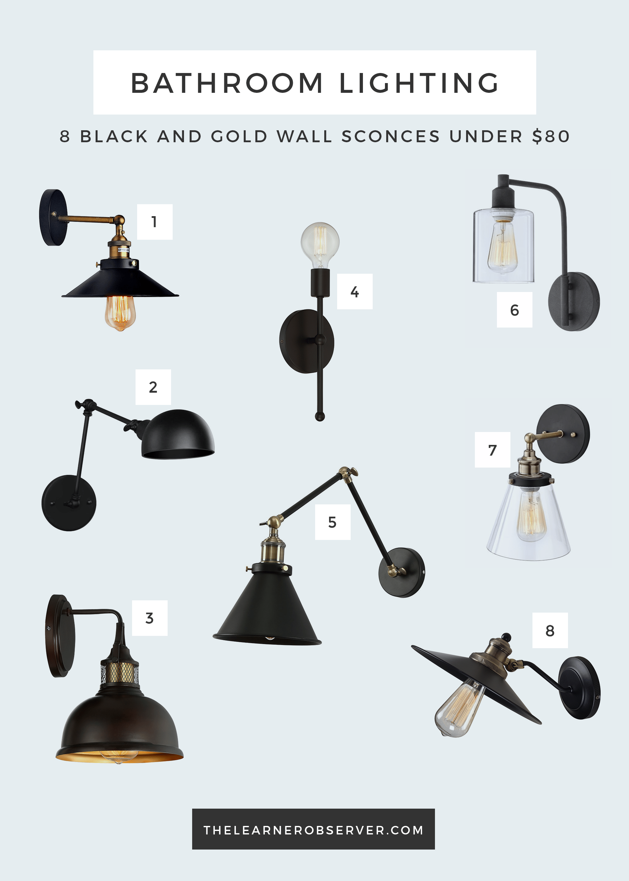
To help with selecting lighting for a room like this, check out this post for lighting options under $80!
Sources:Beautiful shiplap and tile work: Grain Works CollectiveSink- Lowe's. Only available in store. Similar here.Faucet - Lowe's Mirror - IKEALight fixture - AmazonToilet - Lowe'sWindow blind: IKEAPaint - Walls: Sherwin Williams, 'Alabaster' SW 7008. Ceiling: Para Paints 'Tuxedo' P5249-85Tile - Home DepotTissue paper holder - CB2Black & White basket - Target (it's old, sorry!)Hand towel - Homesense (HomeGoods for you American friends) and it's actually a kitchen towel. Shhh... no one has to know!Faux succulent: Loblaws Superstore (it was on clearance so I'm not sure they have more!)Brass mist sprayer - Value Village (yes, seriously. And it was $4. Be jealous.)Milk glass vase - one of many thrifted finds of mine!Picture frames - Target (again, old - like when they used to be in Canada, old)Jamaica map - EtsyBrazil map - Etsy
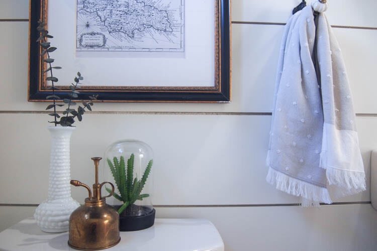
It's been a pleasure being a part of another One Room Challenge, and I'm so glad I managed to finish this one, even if it was the tiniest room of all! Don't forget to check out all the other participants!
